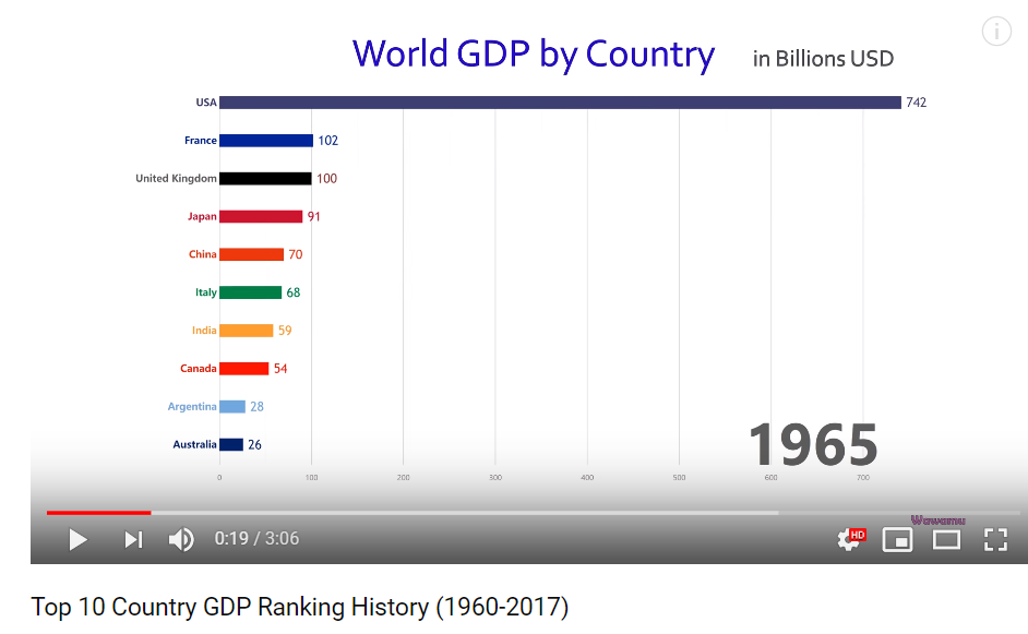
Hi~I recently notice a fatanstic bar chart data comparison video in youtube,below is the video link:

i want to create a 3D version of this kind of data comparision video by python ,so that i can batch generate animation by easily input data
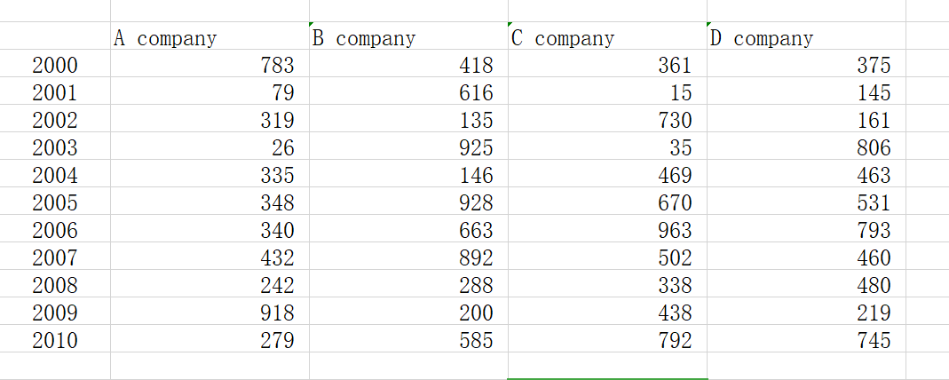
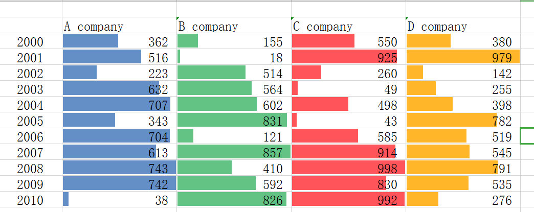
For example i have a data named :Four companies profit from 2000 to 2010

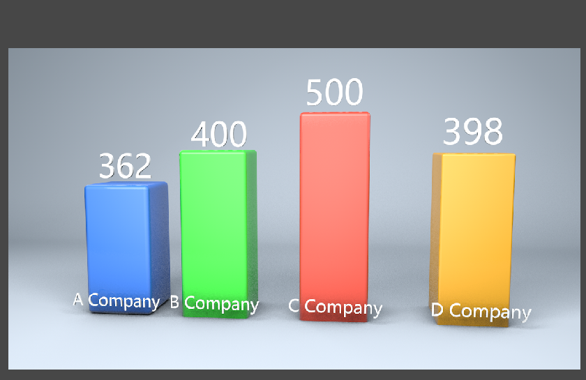
and i want to create 4 bar chart cubes respectively ,1th key represents 2000 year ,25th to 2001 year and so on ,each cube Y size key-value is the profit respectively ,in 1th key,A company Y size is 398 ,B 400 ,C 500,D 600, and in 25th ,each Y size value is the profit of 2001.

This is the simple demonstration i make in C4D by hand

i am crazy to achieving it by python,easily input data ,automatically create cube or cylinder and generate key and value and changeable number ,this is a powerful tool,well,i know definitely it is not easy
it is a big project !!!
**so i just want to ask the possibility of this code
if it can be achieve in C4D by python ?
could you please tell me the probable direction or the python module i should to use ?
if you can demonstrate with some basic code ,i would be grateful !
Thanks ~
**
i