c4d.gui.GeDialog
-
class
c4d.gui.GeDialog¶ - A dialog is a window or a panel, in which buttons, edit boxes, icons, images, and other things are put upon.These buttons, sliders, icons, etc are called widgets.Dialogs act as interfaces for a plugin.You are able to customize or derive a dialog box that will act as an interface for your plugin.Most dialog boxes are derived off of
GeDialogclass.The reason you care about dialogs is that you want anyone to be able to use your plugin, and you want it to be easier to use.Plus it is a lot cooler when you have tons of widgets to play with.There is no other (easy) interactive way for you to interface with the user than with a dialog.Border Type
Methods Signatures
Magic Methods
Init a GeDialog. |
Methods to Override
Override it to avoid closing the dialog if an error situation has occurred.
|
|
Override this function if you want to react to user clicks.
|
|
Override this function if you want to react to Cinema 4D core messages.
|
|
Override - Called when Cinema 4D is about to display the dialog. |
|
Override this method - this function is called when the dialog is about to be closed temporarily, for example for layout switching. |
|
Called when the dialog is initialized by the GUI. |
|
Override this function to react to more messages than covered by the other functions.
|
|
If you subscribe to timer events using |
Basic Methods
Close the dialog. |
|
Enables or disables the dialog gadget, depending on the value of enable. |
|
Gets the dialog ID. |
|
Return the type of a gadget. |
|
Loads an external resource file.
|
|
Opens the dialog at the specified position. |
|
Used to restore an asynchronous dialog that has been placed in the users layout. |
|
Sends a message to a dialog gadget. |
|
Sends a message to the parent dialog. |
|
Initializes the timer clock, so that |
Coordinate Methods
Transforms global coordinates (relative to the top left corner of the physical window) to local coordinates (relative to the top left corner of the dialog). Result is a dict with member keys x and y of type int. |
|
Transforms local coordinates (relative to the top left corner of the dialog) to global coordinates (relative to the top left corner of the physical window). Result is a dict with member keys x and y of type int. |
|
Transforms local coordinates (relative to the top left corner of the dialog) to screen coordinates (relative to the top left corner of the system screen). Result is a dict with member keys x and y of type int. |
|
Transforms screen coordinates (relative to the top left corner of the system screen) to local coordinates (relative to the top left corner of the dialog). Result is a dict with member keys x and y of type int. |
Deprecated
Deprecated since version R15: Use |
|
Deprecated since version R15: Use |
|
Deprecated since version R15. |
|
Deprecated since version R15: Use |
Dialog Change Methods
Clears the item list of combo boxes and popup buttons. |
|
Hides/unhides an element from the dialog. |
|
Notifies Cinema 4D that the layout of a dynamic group in the dialog has changed.
|
|
Notifies Cinema 4D that the layout of a dynamic group in the dialog has changed.
|
|
Removes all controls from a group and places the control insertion point within the group.
|
|
Removes all controls from a group and places the control insertion point within the group.
|
|
Removes an element from the dialog. |
Dialog Checks Methods
Retrieve if the dialog is open but currently folded away in the layout. |
|
Checks if the given gadget has the focus. |
|
Checks if the dialog is open. |
|
Checks if the dialog is visible. |
Dialog Group Methods
Queries a scroll group for its currently visible region, a rectangle between (x1,y1) and (x2,y2).
|
|
Begins a group. |
|
Begins a group in the menu bar of the dialog. |
|
Sets the border type of the current group, and displays the title in the border if possible. |
|
Sets the border type of the current group, and displays the title in the border if possible. |
|
Sets the border size around the current group in pixels. |
|
Ends groups. |
|
Sets the space in pixels between two elements in the current group.
|
|
Sets group weights for group id. |
|
Retrieves group weights for group id. |
|
Begins a scrollgroup. |
|
Scrolls a scroll group so that the rectangle spanned between the pixel coordinates (x1, y1, x2, y2) is visible.
|
|
Begins a tab group. |
Dialog Information Methods
Checks the drag position in a drag event message against a certain dialog element’s position in the layout. |
|
Gets the RGB values associated with a color ID. |
|
Extracts the object from a drag and drop message. |
|
Extracts local drag coordinates from a drag and drop event. |
|
Sets the correct cursor during drag and drop handling. |
Dialog Menu Methods
Adds a command item to the current menu.
|
|
Adds a separator to the current menu. |
|
Adds a string item to the current menu. |
|
Call this function when all menus and all items have been added. |
|
Flushes the menu bar of the dialog, removing all menus.
|
|
Used to change the enabled/disabled and checked/unchecked state of menu items.
|
|
Sets the menu from a MENU resource ID. |
|
Creates a new menu group.
|
|
Closes the current menu group, opened with |
Dialog Setter Methods
Set the default color for GUI elements. |
|
Fold the dialog away in the layout. |
|
Sets the title of the dialog window. |
Gadget Addition Methods
Adds an arrow button to the layout. |
|
Add a button to the dialog. |
|
Add a checkbox to the dialog. |
|
Adds items to combo boxes or popup buttons. The resource equivalent is CHILDS. |
|
Adds a color field with sliders to the layout. |
|
Adds a simple color field without sliders to the layout. |
|
Adds a combo box to the layout. |
|
Adds a combo button to the layout. |
|
Adds a custom GUI to the dialog. |
|
Adds a dialog group with standard buttons to the layout. |
|
Adds an editable number field to the layout. |
|
Adds an editable number field with up/down arrows to the layout. |
|
Adds a field for editing shortcuts. |
|
Adds a slider with an editable number field to the layout. |
|
Adds an editable text field to the layout. |
|
Add a gadget to the dialog. |
|
Adds an editable text field with multiple lines to the layout. |
|
Adds a popup button to the layout. |
|
Adds a radio button to the layout. |
|
Adds a radio group to the layout. |
|
Adds a text radio button to the layout (like the ones to the left in the Cinema 4D material editor). |
|
Adds a horizontal separator to the layout. |
|
Adds a vertical separator to the layout. |
|
Adds a slider to the layout. |
|
Adds a static text field to the layout. |
|
Adds a sub-dialog to the layout. |
|
Adds a user area to the layout. |
Gadget Checks Methods
Checks if the dialog can be closed. Normally checks the value ranges and calls |
|
Speedup function that checks if a core message is new or has been already processed. |
|
Indicates whatever a control’s content has been changed since the last time its value was set manually with. |
|
Checks if the value for all input fields are within the allowed range. |
|
Always returns 1.0 except for user areas shown on OS X Retina displays, where it returns 2.0. |
|
Checks if a dialog item is enabled. |
Gadget Getter Methods
Get the custom GUI for a certain ID. |
|
Retrieves the value of checkbox controls. |
|
Retrieves the color and brightness of color controls. |
|
Retrieves the text from string controls as a filename. |
|
Retrieves the value of float fields. |
|
Retrieves the value of integer fields. |
|
Retrieves the text from string controls.
|
|
Retrieves the time of time fields. |
|
Retrieves the value of three float fields at the same time as a vector. |
Gadget Information Methods
Queries a dialog control for its current position and size in pixels.
|
Gadget Setter Methods
Sets the focus to a specific control within the dialog. |
|
Adds children to a dialog element using a container. |
|
Attaches a
c4d.gui.SubDialog derived object to a sub-dialog control, added with AddSubDialog(). |
|
Assigns a
GeUserArea object to a user area control in the dialog. |
|
Sets the value of checkbox controls. |
|
Sets the color, brightness and limits of color fields and color choosers. |
|
Sets the value and limits of an angle field. |
|
Sets the text of string controls, taking the new value from a filename. |
|
Sets the value, unit and limits of float fields. |
|
Sets the value and limits of integer fields. |
|
Sets the value and limits of a meter field. |
|
Locks/unlocks multi-line edit fields. |
|
Sets the edit mode for multi-line edit fields. |
|
Set the cursor position within a dialog multi-line string item. |
|
Sets the value and limits of a percent field. |
|
Sets the item list of a popup button using a popup menu container. |
|
Sets the text of string controls.
|
|
Sets the value and limits of a time field. |
Input Events Methods
Gets the next input event for a certain device from the event queue. |
|
Polls a certain channel of a device for the current input state. |
|
Flushes all events from the window message queue. For example if you loop while the mouse is down (polling) you can call this command to flush all keydowns/mouseclicks that are made during the loop. |
Inheritance
Child Class:
Methods Documentation
-
GeDialog.__init__(self)¶ Init a GeDialog.
-
GeDialog.AskClose(self)¶ - Override it to avoid closing the dialog if an error situation has occurred.If the user wants to close the dialog with the OK button this function will be called.
Note
If you return False everything will be as usual, but if you return True the dialog won’t close.
Warning
Please pay attention to the result value.True means, it will not close.- Return type
bool
- Returns
True if the dialog shouldn’t be closed, False if it should.
-
GeDialog.Command(self, id, msg)¶ - Override this function if you want to react to user clicks.Whenever the user clicks on a gadget and/or changes its value this function will be called.It is also called when a string menu item is selected. Override it to handle such events.
Note
Remember that you need to call
StopAllThreads()before making modifications to the scene.- Parameters
id (int) – The ID of the gadget that triggered the event.
msg (c4d.BaseContainer) –
The original message container. Contains the following values:
BFM_ACTION_ID
int
ID of the dialog element that triggered the action.
BFM_ACTION_VALUE
any
Action value.
BFM_ACTION_INDRAG
bool
Slider in dragging mode (not finished).
BFM_ACTION_STRCHG
bool
String in text field changed.
BFM_ACTION_VALCHG
bool
Edit/slider changed.
BFM_ACTION_ESC
bool
Action escaped. Internal.
BFM_ACTION_RESET
bool
Reset to default value on right-click of input field arrows.
BFM_ACTION_UPDATE
bool
Update without verify. Internal.
BFM_ACTION_KEYDOWN
bool
New in version S24: Key Down pressed while editfield is active.
BFM_ACTION_KEYUP
bool
New in version S24: Key Up pressed while editfield is active.
- Return type
bool
- Returns
False if there was an error, otherwise True.
-
GeDialog.CoreMessage(self, id, msg)¶ - Override this function if you want to react to Cinema 4D core messages.The original message is stored in msg.
- Parameters
id (int) – The received core message.
msg (c4d.BaseContainer) – The message container.
- Return type
bool
- Returns
Currently not used - but you have to return a bool value.
-
GeDialog.CreateLayout(self)¶ Override - Called when Cinema 4D is about to display the dialog.
- Return type
bool
- Returns
True if successful, or False to signalize an error.
-
GeDialog.DestroyWindow(self)¶ Override this method - this function is called when the dialog is about to be closed temporarily, for example for layout switching.
-
GeDialog.InitValues(self)¶ Called when the dialog is initialized by the GUI.
- Return type
bool
- Returns
True if successful, or False to signalize an error.
-
GeDialog.Message(self, msg, result)¶ - Override this function to react to more messages than covered by the other functions.Normally this is not necessary.
Note
If overridden, include a call to the base version of this function,
GeDialog.Message():See also
C4DAtom and Plugin Messages for information on the messages type, data and input/output.
def Message(self, msg, result):
    return c4d.gui.GeDialog.Message(self, msg, result)
- Parameters
msg (BaseContainer) – The message container.
result (BaseContainer) – A container to store results in.
- Return type
int
- Returns
The return value depends on the message.
-
GeDialog.Timer(self, msg)¶ If you subscribe to timer events using
SetTimer()(x), this function is called every x’th millisecond.- Parameters
msg (BaseContainer) – The raw timer message.
-
GeDialog.Close(self)¶ Close the dialog.
- Return type
bool
- Returns
True if successfully closed, otherwise False.
-
GeDialog.Enable(self, gadget, enable)¶ Enables or disables the dialog gadget, depending on the value of enable.
- Parameters
gadget (
C4DGadget) – The dialog gadgetenable (bool) – True means enabled, otherwise False.
-
GeDialog.GetId(self)¶ Gets the dialog ID.
- Return type
int
- Returns
The id.
-
GeDialog.GetType(self, id)¶ Return the type of a gadget.
- Parameters
id (int) – The gadget id.
- Return type
int
- Returns
The gadget id type.
-
GeDialog.LoadDialogResource(self, id, lr=None, flags=0)¶ - Loads an external resource file.This is the preferred method for dialog layout since it gives maximum flexibility and easy multi language support.
Note
The dialog loaded is automatically surrounded by an additional outer group, so flags means the same as with dialog groups (e.g. BFV_CENTER).
- Parameters
id (int) – The dialog ID.
lr (Optional[c4d.plugins.GeResource]) – A loaded resource or None. If this is None then the global resource singleton is used.
flags (int) – Additional layout flags.
- Return type
bool
- Returns
true if the dialog was successfully loaded, otherwise false.
-
GeDialog.Open(self, dlgtype, pluginid=0, xpos=- 1, ypos=- 1, defaultw=0, defaulth=0, subid=0)¶ Opens the dialog at the specified position.
Note
If xpos = -1 and ypos = -1 the dialog will be opened at the current mouse position.If xpos = -2 and ypos = -2 the dialog will be opened at the center of the screen.- Parameters
dlgtype (int) –
The dialog type:
DLG_TYPE_MODAL
Modal dialog.
DLG_TYPE_MODAL_RESIZEABLE
Resizable modal dialog.
DLG_TYPE_ASYNC
Asynchronous dialog.
DLG_TYPE_ASYNC_POPUP_RESIZEABLE
Asynchronous dialog: resizable popup dialog style (no menu bar).
DLG_TYPE_ASYNC_POPUPEDIT
Asynchronous dialog: popup dialog style (no menu bar, no window frame).
DLG_TYPE_ASYNC_FULLSCREEN_WORK
Asynchronous dialog: fullscreen over desktop area.
DLG_TYPE_ASYNC_FULLSCREEN_MONITOR
Asynchronous dialog: fullscreen over the whole monitor area.
DLG_TYPE_ASYNC_TOOLBAR
Non-modal (asynchronous) dialog. Toolbar style with no minimize/maximize buttons, but close button
pluginid (int) – The plugin ID of
CommandData.xpos (int) – The X position of the dialog. See note above.
ypos (int) – The Y position of the dialog. See note above.
defaultw (int) – The default width in pixels.
defaulth (int) – The default height in pixels.
subid (int) – The dialog sub-ID. This can be used to open several dialogs with a single command plugin for
CommandData.ExecuteSubID().
- Return type
bool
- Returns
True if successful, otherwise False.
-
GeDialog.Restore(self, pluginid, secret)¶ Used to restore an asynchronous dialog that has been placed in the users layout.
Note
Just use this method in
CommandData.RestoreLayout().- Parameters
pluginid (int) – The plugin ID of the menu plugin.
secret (PyCObject) – The secret argument of
CommandData.RestoreLayout().
- Return type
bool
- Returns
True if successfully restored, otherwise False.
-
GeDialog.SendMessage(self, id, value)¶ Sends a message to a dialog gadget.
- Parameters
id (Union[c4d.gui.C4DGadget, int]) – The control ID or int.
value (c4d.BaseContainer) – The message container.
- Return type
object
- Returns
Depends on the message.
-
GeDialog.SendParentMessage(self, msg)¶ Sends a message to the parent dialog.
- Parameters
msg (c4d.BaseContainer) – The message container.
- Return type
bool
- Returns
True if the message was sent.
-
GeDialog.SetTimer(self, value)¶ Initializes the timer clock, so that
Timer()is called every timer milliseconds. UseSetTimer()(0) to stop the clock.Note
Depending on the speed of the computer, the operating system, the complexity of the dialog and the threads running in the background, there is no guarantee that event messages will occur on a regular basis.Using a value of 500 ms should be no problem but if using a value of 1 ms one might get events with the following time spaces: 3 ms, 76 ms, 15 ms, 19 ms, 67 ms…Note
The timer will be paused while a synchronous dialog is opened in Cinema 4D.
Warning
Keep in mind that using small timer values results in heavy message traffic in the application which may slow down Cinema 4D.
- Parameters
value (int) – The timer interval in milliseconds.
-
GeDialog.Global2Local(self)¶ Transforms global coordinates (relative to the top left corner of the physical window) to local coordinates (relative to the top left corner of the dialog). Result is a dict with member keys x and y of type int.
- Return type
Optional[Dict[x: int, y: int]]
- Returns
The converted coordinates or None.
-
GeDialog.Local2Global(self)¶ Transforms local coordinates (relative to the top left corner of the dialog) to global coordinates (relative to the top left corner of the physical window). Result is a dict with member keys x and y of type int.
- Return type
Optional[Dict[x: int, y: int]]
- Returns
The converted coordinates or None.
-
GeDialog.Local2Screen(self)¶ Transforms local coordinates (relative to the top left corner of the dialog) to screen coordinates (relative to the top left corner of the system screen). Result is a dict with member keys x and y of type int.
- Return type
Optional[Dict[x: int, y: int]]
- Returns
The converted coordinates or None.
-
GeDialog.Screen2Local(self)¶ Transforms screen coordinates (relative to the top left corner of the system screen) to local coordinates (relative to the top left corner of the dialog). Result is a dict with member keys x and y of type int.
- Return type
Optional[Dict[x: int, y: int]]
- Returns
The converted coordinates or None.
-
GeDialog.GetLong(self, id)¶ Deprecated since version R15: Use
GetInt32()instead.Retrieves the value of integer fields.
Note
Also used for tab groups, radio buttons and combo boxes.
- Parameters
id (Union[c4d.gui.C4DGadget, int]) – The control ID or int.
- Return type
Optional[int]
- Returns
The value or None if the value was not retrieved.
-
GeDialog.GetReal(self, id)¶ Deprecated since version R15: Use
GetFloat()instead.Retrieves the value of float fields.
- Parameters
id (Union[c4d.gui.C4DGadget, int]) – The control ID or int.
- Return type
Optional[float]
- Returns
The value or None if the value was not retrieved.
-
GeDialog.SetLong(self, id, value, min=MINLONGl, max=MAXLONGl, step=1, tristate=False, min2=MINLONGl, max2=MAXLONGl)¶ Deprecated since version R15: Use
SetInt32()instead.Sets the value and limits of integer fields.
Note
Also used for tab groups, radio buttons and combo boxes.
- Parameters
id (Union[c4d.gui.C4DGadget, int]) – The control ID or int.
value (int) – The new value.
min (int) – The minimum value accepted.
max (int) – The maximum value accepted.
step (bool) – The step used for arrow buttons.
step – If this is True the control is tinted blue to indicate tristate mode.
min2 (int) – The minimum value allowed outside the range used for sliders. Overrides min for the acceptance check.
max2 (int) – The minimum value allowed outside the range used for sliders. Overrides max for the acceptance check.
- Return type
bool
- Returns
True if the value was set.
-
GeDialog.SetReal(self, id, value, min=sys.float_info.min, max=sys.float_info.max, step=1.0, format=FORMAT_FLOAT, min2=0.0, max2=0.0, quadscale=False, tristate=False)¶ Deprecated since version R15: Use
SetFloat()instead.Sets the value, unit and limits of float fields.
- Parameters
id (Union[c4d.gui.C4DGadget, int]) – The control ID or int.
value (float) – The new value.
min (int) – The minimum value accepted.
max (int) – The maximum value accepted.
step (float) – The step used for arrow buttons.
format (int) –
The unit and format of the field. Valid formats are:
FORMAT_FLOAT
Floating point without unit.
FORMAT_INT
Integer without unit.
FORMAT_PERCENT
Floating point with % sign, 1.0 = 100%.
FORMAT_DEGREE
Floating point with ° sign. Measured in radians, displayed in degrees.
FORMAT_METER
Floating point in the current working unit.
FORMAT_FRAMES
Time formatted as frames. (Overrided by user preference.)
FORMAT_SECONDS
Time formatted as seconds. (Overrided by user preference.)
FORMAT_SMPTE
Time formatted as SMPTE. (Overrided by user preference.)
min2 (int) – The minimum value allowed outside the range used for sliders. Overrides min for the acceptance check.
max2 (int) – The maximum value allowed outside the range used for sliders. Overrides max for the acceptance check.
quadscale (bool) – If this is True a quadratic scale is used for the slider, so that more precision is available for lower values.
tristate (bool) – If this is True the control is tinted blue to indicate tristate mode.
- Return type
bool
- Returns
True if the value was set.
-
GeDialog.FreeChildren(self, id)¶ Clears the item list of combo boxes and popup buttons.
- Parameters
id (Union[c4d.gui.C4DGadget, int]) – The control ID or int.
- Return type
bool
- Returns
True if the children were removed.
-
GeDialog.HideElement(self, id, hide)¶ Hides/unhides an element from the dialog.
- Parameters
id (int) – The control ID.
hide (bool) – True to hide and False to unhide.
- Return type
bool
- Returns
True if the element was hidden/unhidden.
-
GeDialog.LayoutChanged(self, id)¶ - Notifies Cinema 4D that the layout of a dynamic group in the dialog has changed.This is usually done by first calling
LayoutFlushGroup()and then adding new controls.- Parameters
id (int) – The ID of the changed group.
- Return type
bool
- Returns
True if the layout was updated, otherwise False.
-
GeDialog.LayoutChangedNoRedraw(self, id)¶ - Notifies Cinema 4D that the layout of a dynamic group in the dialog has changed.This is usually done by first calling
LayoutFlushGroup()and then adding new controls.- Parameters
id (Union[c4d.gui.C4DGadget, int]) – The ID of the changed group.
- Return type
bool
- Returns
True if the layout was updated, otherwise False.
-
GeDialog.LayoutFlushDisableRedraw(self, id: int, disable: bool)¶ - Removes all controls from a group and places the control insertion point within the group.Calling this method while passing True for disable will cause the group not be redrawn once it has been flushed. For each call of LayoutFlushDisableRedraw(True) one must call LayoutFlushDisableRedraw(False).
New in version 2023.2.0.
- Parameters
id (int) – The ID of the group.
disable (bool) – True to disable redraw.
- Return type
bool
- Returns
True if the group was disabled/enabled for redraw, otherwise False.
-
GeDialog.LayoutFlushGroup(self, id)¶ - Removes all controls from a group and places the control insertion point within the group.This makes it possible to have dynamic groups.
Note
After all components are added call
LayoutChanged()with the group ID.- Parameters
id (int) – The control ID.
- Return type
bool
- Returns
True if the group was flushed.
-
GeDialog.RemoveElement(self, id)¶ Removes an element from the dialog.
- Parameters
id (int) – The control ID.
- Return type
bool
- Returns
True if the element was removed.
-
GeDialog.GetFolding(self)¶ Retrieve if the dialog is open but currently folded away in the layout.
New in version 24.
- Return type
bool
- Returns
True if folded.
-
GeDialog.IsActive(self, id)¶ Checks if the given gadget has the focus.
- Parameters
id (int) – The control ID.
- Return type
bool
- Returns
True if the control is active, otherwise False.
-
GeDialog.IsOpen(self)¶ Checks if the dialog is open.
- Return type
bool
- Returns
True if it is open, otherwise False.
-
GeDialog.IsVisible(self)¶ Checks if the dialog is visible.
- Return type
bool
- Returns
True if it is visible, otherwise False.
-
GeDialog.GetVisibleArea(self, scrollgroup)¶ - Queries a scroll group for its currently visible region, a rectangle between (x1,y1) and (x2,y2).The coordinates are in pixels.
- Parameters
scrollgroup (int) – The scroll group ID.
- Return type
dict{x1: int, y1: int , x2: int , y2: int }
- Returns
The visible area in coordinates, in keys x1, y1, x2, y2.
-
GeDialog.GroupBegin(self, id, flags, cols=0, rows=0, title='', groupflags=0, initw=0, inith=0)¶ Begins a group.
- Parameters
id (int) – The ID of the group.
flags (int) –
Layout flags:
BFH_CENTER
Centered horizontally.
BFH_LEFT
Aligned to the left.
BFH_RIGHT
Aligned to the right.
BFH_FIT
Fit horizontally. BFH_LEFT | BFH_RIGHT.
BFH_SCALE
Scale horizontally if there is more space.
BFH_SCALEFIT
Scale fit horizontally. BFH_SCALE | BFH_FIT.
BFH_MASK
Masks out flags.
BFV_CENTER
Centered vertically.
BFV_TOP
Aligned to the top.
BFV_BOTTOM
Aligned to the bottom.
BFV_FIT
Fit. BFV_BOTTOM | BFV_TOP.
BFV_SCALE
Scale vertically if there is more space.
BFV_SCALEFIT
Scale fit vertically. BFV_SCALE | BFV_FIT.
BFV_MASK
Masks out flags.
cols (int) – Columns.
rows (int) – Rows
title (str) – The title.
groupflags (int) –
Settings for the group. Can be a combination of the following:
BFV_GRIDGROUP_EQUALCOLS
Each column has the same width.
BFV_GRIDGROUP_EQUALROWS
Each row has the same height.
BFV_CMD_EQUALCOLUMNS
Columns have equal width.
BFV_BORDERGROUP_CHECKBOX
Checkbox in title of a border group.
BFV_BORDERGROUP_FOLD
Fold symbol in title of a border group. Deprecated.
BFV_BORDERGROUP_FOLD_OPEN
Opened fold symbol.
BFV_BORDERGROUP_FOLD2
Foldable group, but no switch gadget.
BFV_GRIDGROUP_ALLOW_WEIGHTS
Allow the user to move the weights.
BFV_GRIDGROUP_FORBID_MIRROR
Do not mirror the layout of the group.
BFV_DIALOG_REMOVEABLE
Dialog is removable.
BFV_DIALOG_BAR_VERT
Dialog has a vertical dialog bar.
BFV_DIALOG_NOBUTTONS
Dialog has no button bar.
BFV_LAYOUTGROUP_PALETTEOUTLINES
Layout group has palette outlines.
BFV_IGNORE_FOCUS
Group ignores focus.
BFV_TABGROUP_RELOADDIALOG
Private.
BFV_LAYOUTGROUP_NODROP
Prevents drag and drop onto a tab. Private.
BFV_LAYOUTGROUP_NODROP2
Prevents drag and drop between layout groups. Private.
BFx_NOEQUAL
Groups with BFV_GRIDGROUP_EQUALCOLS or BFV_GRIDGROUP_EQUALROWS flags can have their own maximum width.
BFH_FIXED
Fixed horizontal size.
BFV_FIXED
Fixed vertical size.
initw (int) –
New in version R14.014: Initial width.
inith (int) –
New in version R14.014: Initial height.
- Return type
bool
- Returns
True if a group could be begun, otherwise False.
-
GeDialog.GroupBeginInMenuLine(self)¶ Begins a group in the menu bar of the dialog.
Note
End the group with
GroupEnd()
-
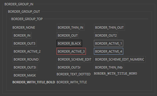
GeDialog.GroupBorder(self, borderstyle)¶ Sets the border type of the current group, and displays the title in the border if possible.
Note
UseGroupBorderNoTitle()if you do not have a title.Otherwise there’ll be a small gap in the border where the title would be.- Parameters
borderstyle (int) –
The style:
BORDER_NONE
No border.
BORDER_THIN_IN
Thin border inward.
BORDER_THIN_OUT
Thin border outward.
BORDER_IN
Normal border inward.
BORDER_OUT
Normal border outward.
BORDER_GROUP_IN
Group border inside.
BORDER_GROUP_OUT
Group border outside.
BORDER_OUT2
Outward border 2.
BORDER_OUT3
Outward border 3
BORDER_BLACK
Thin black line.
BORDER_ACTIVE_1
Active border 1.
BORDER_ACTIVE_2
Active border 2.
BORDER_ACTIVE_3
Active border 3.
BORDER_ACTIVE_4
Active border 4.
BORDER_GROUP_TOP
Border along the top.
BORDER_ROUND
Border with round corners.
BORDER_SCHEME_EDIT
Edit field border like the shortcut gadget for example.
BORDER_SCHEME_EDIT_NUMERIC
Edit field border that is open to the right like the link field for example.
BORDER_OUT3l
Outward border 3, open to the left.
BORDER_OUT3r
Outward border 3, open to the right.
BORDER_THIN_INb
Thin border inward, open to the botton.
BORDER_MASK
Masks out border type.
BORDER_TEXT_DOTTED
New in version R21:Only used withGeDialog.AddStaticText().Draws a dotted line at right of text, useful to visually connect the text with its parameter.BORDER_WITH_TITLE_MONO
Display group title with monospaced font.
BORDER_WITH_TITLE_BOLD
Display group title with bold font.
BORDER_WITH_TITLE
Display group title in the border.
-
GeDialog.GroupBorderNoTitle(self, borderstyle)¶ Sets the border type of the current group, and displays the title in the border if possible.
- Parameters
borderstyle (int) –
The style:
BORDER_NONE
No border.
BORDER_THIN_IN
Thin border inward.
BORDER_THIN_OUT
Thin border outward.
BORDER_IN
Normal border inward.
BORDER_OUT
Normal border outward.
BORDER_GROUP_IN
Group border inside.
BORDER_GROUP_OUT
Group border outside.
BORDER_OUT2
Outward border 2.
BORDER_OUT3
Outward border 3
BORDER_BLACK
Thin black line.
BORDER_ACTIVE_1
Active border 1.
BORDER_ACTIVE_2
Active border 2.
BORDER_ACTIVE_3
Active border 3.
BORDER_ACTIVE_4
Active border 4.
BORDER_GROUP_TOP
Border along the top.
BORDER_ROUND
Border with round corners.
BORDER_SCHEME_EDIT
Edit field border like the shortcut gadget for example.
BORDER_SCHEME_EDIT_NUMERIC
Edit field border that is open to the right like the link field for example.
BORDER_OUT3l
Outward border 3, open to the left.
BORDER_OUT3r
Outward border 3, open to the right.
BORDER_THIN_INb
Thin border inward, open to the botton.
BORDER_MASK
Masks out border type.
BORDER_TEXT_DOTTED
New in version R21:Only used withGeDialog.AddStaticText().Draws a dotted line at right of text, useful to visually connect the text with its parameter.BORDER_WITH_TITLE_MONO
Display group title with monospaced font.
BORDER_WITH_TITLE_BOLD
Display group title with bold font.
BORDER_WITH_TITLE
Display group title in the border.
-
GeDialog.GroupBorderSpace(self, left, top, right, bottom)¶ Sets the border size around the current group in pixels.
- Parameters
left (int) – The distance to the left of the group.
top (int) – The distance above the group.
right (int) – The distance to the right of the group.
bottom (int) – The distance below the group.
- Return type
bool
- Returns
True if the border space was set.
-
GeDialog.GroupEnd(self)¶ Ends groups.
- Return type
bool
- Returns
True if the group was ended, otherwise False.
-
GeDialog.GroupSpace(self, spacex, spacey)¶ - Sets the space in pixels between two elements in the current group.Equivalent to SPACE in dialog resources.
- Parameters
spacex (int) – The X distance.
spacey (int) – The Y distance.
- Return type
bool
- Returns
True if the spacing could be set.
-
GeDialog.GroupWeightsLoad(self, id, weights)¶ Sets group weights for group id.
The group weights are usually absolute values.
Note
If an element has a bigger minimum size the given weight will be ignored.The sum of the weights do not need to be 100.Note
A weight value can be negative.In this case the group keeps its size absolute and it is not resized proportionally.def CreateLayout(): self.GroupBegin(GRP_SUB,c4d.BFH_SCALEFIT|c4d.BFV_SCALEFIT,2,0,"",c4d.BFV_GRIDGROUP_ALLOW_WEIGHTS) self.AddStaticText(1000,c4d.BFH_SCALEFIT|c4d.BFV_SCALEFIT,0,0,"SubDialog2",c4d.BORDER_THIN_IN) self.AddStaticText(1001,c4d.BFH_SCALEFIT|c4d.BFV_SCALEFIT,0,0,"SubDialog2",c4d.BORDER_THIN_IN) self.AddStaticText(1002,c4d.BFH_SCALEFIT|c4d.BFV_SCALEFIT,0,0,"SubDialog2",c4d.BORDER_THIN_IN) self.AddStaticText(1003,c4d.BFH_SCALEFIT|c4d.BFV_SCALEFIT,0,0,"SubDialog2",c4d.BORDER_THIN_IN) self.AddStaticText(1004,c4d.BFH_SCALEFIT|c4d.BFV_SCALEFIT,0,0,"SubDialog2",c4d.BORDER_THIN_IN) self.AddStaticText(1005,c4d.BFH_SCALEFIT|c4d.BFV_SCALEFIT,0,0,"SubDialog2",c4d.BORDER_THIN_IN) self.AddEditNumberArrows(1006, c4d.BFH_SCALEFIT) if not self.weights_saved: #initialization code self.weights.SetInt32(c4d.GROUPWEIGHTS_PERCENT_W_CNT, 2) # number of columns - has to be equal to the given layout self.weights.SetFloat(c4d.GROUPWEIGHTS_PERCENT_W_VAL+0,25.0) # weight for col 1 self.weights.SetFloat(c4d.GROUPWEIGHTS_PERCENT_W_VAL+1,75.0) # weight for col 2 #set the rows self.weights.SetInt32(c4d.GROUPWEIGHTS_PERCENT_H_CNT,4) # number of rows - has to be equal to the given layout self.weights.SetFloat(c4d.GROUPWEIGHTS_PERCENT_H_VAL+0,10.0) # weight for row 1 self.weights.SetFloat(c4d.GROUPWEIGHTS_PERCENT_H_VAL+1,30.0) # weight for row 2 self.weights.SetFloat(c4d.GROUPWEIGHTS_PERCENT_H_VAL+2,60.0) # weight for row 3 self.weights.SetFloat(c4d.GROUPWEIGHTS_PERCENT_H_VAL+3,0.0) # weight for row 4 self.weights_saved = True self.GroupWeightsLoad(GRP_SUB, self.weights) self.GroupEnd() return True def Message(self, msg, result): if msg.GetId()==c4d.BFM_WEIGHTS_CHANGED: #if the weights change because of user interaction you will get notified if msg.GetInt32(c4d.BFM_WEIGHTS_CHANGED)==GRP_SUB: self.weights = self.GroupWeightsSave(GRP_SUB) return GeDialog.Message(self, msg, result)
- Parameters
id (Union[c4d.gui.C4DGadget, int]) – The control ID or int.
weights (c4d.BaseContainer) –
The weights to store:
GROUPWEIGHTS_PERCENT_W_CNT
int
The number of columns. Has to to be equal to the given layout.
GROUPWEIGHTS_PERCENT_W_VAL
float
The column weight for column i is in GROUPWEIGHTS_PERCENT_W_VAL + i.
GROUPWEIGHTS_PERCENT_H_CNT
int
The number of rows. Has to be equal to the given layout.
GROUPWEIGHTS_PERCENT_H_VAL
float
The row weight for row i is in GROUPWEIGHTS_PERCENT_H_VAL + i.
- Return type
bool
- Returns
True if the group weights could be set, otherwise False.
-
GeDialog.GroupWeightsSave(self, id)¶ Retrieves group weights for group id.
- Parameters
id (Union[c4d.gui.C4DGadget, int]) – The control ID or int.
- Return type
Optional[c4d.BaseContainer]
- Returns
A new container with the weights or None.
GROUPWEIGHTS_PERCENT_W_CNT
int
The number of columns. Has to to be equal to the given layout.
GROUPWEIGHTS_PERCENT_W_VAL
float
The column weight for column i is in GROUPWEIGHTS_PERCENT_W_VAL + i.
GROUPWEIGHTS_PERCENT_H_CNT
int
The number of rows. Has to be equal to the given layout.
GROUPWEIGHTS_PERCENT_H_VAL
float
The row weight for row i is in GROUPWEIGHTS_PERCENT_H_VAL + i.
-
GeDialog.ScrollGroupBegin(self, id, flags, scrollflags, initw=0, inith=0)¶ Begins a scrollgroup.
- Parameters
id (int) – The scroll group ID.
flags (int) –
Layout flags:
BFH_CENTER
Centered horizontally.
BFH_LEFT
Aligned to the left.
BFH_RIGHT
Aligned to the right.
BFH_FIT
Fit horizontally. BFH_LEFT | BFH_RIGHT.
BFH_SCALE
Scale horizontally if there is more space.
BFH_SCALEFIT
Scale fit horizontally. BFH_SCALE | BFH_FIT.
BFH_MASK
Masks out flags.
BFV_CENTER
Centered vertically.
BFV_TOP
Aligned to the top.
BFV_BOTTOM
Aligned to the bottom.
BFV_FIT
Fit. BFV_BOTTOM | BFV_TOP.
BFV_SCALE
Scale vertically if there is more space.
BFV_SCALEFIT
Scale fit vertically. BFV_SCALE | BFV_FIT.
BFV_MASK
Masks out flags.
scrollflags (int) –
Additional settings for the scroll group. Can be a combination of the following flags:
SCROLLGROUP_VERT
Allow the group to scroll vertically.
SCROLLGROUP_HORIZ
Allow the group to scroll horizontally.
SCROLLGROUP_NOBLIT
Always redraw the whole group, not just new areas, when scrolling.
SCROLLGROUP_LEFT
Create the vertical slider to the left.
SCROLLGROUP_BORDERIN
Display a small border around the scroll group.
SCROLLGROUP_STATUSBAR
Create a status bar for the scroll group.
SCROLLGROUP_AUTOHORIZ
Only show horizontal slider if needed.
SCROLLGROUP_AUTOVERT
Only show vertical slider if needed.
SCROLLGROUP_NOSCROLLER
No scroller.
SCROLLGROUP_NOVGAP
No vertical gap.
SCROLLGROUP_STATUSBAR_EXT_GROUP
Create an extern group within the statusbar.
SCROLLGROUP_BORDERINb
- Same as SCROLLGROUP_BORDERIN but open at bottom.
New in version R21.
ID_SCROLLGROUP_STATUSBAR_EXTLEFT_GROUP
ID of the extern left scroll group statusbar group.
ID_SCROLLGROUP_STATUSBAR_EXTRIGHT_GROUP
ID of the extern right scroll group statusbar group.
initw (int) – The initial width of the scroll area.
inith (int) – The initial height of the scroll area.
- Return type
bool
- Returns
True if scrollgroup was added.
-
GeDialog.SetVisibleArea(self, scrollgroupid, x1, y1, x2, y2)¶ - Scrolls a scroll group so that the rectangle spanned between the pixel coordinates (x1, y1, x2, y2) is visible.Other than
GeDialog.GetItemDim(), the method does not take scrollbars into account when determining the scroll area of a scroll group. The method is also sensitive to scroll-rectangles (x1, y1, x2, y2) which are larger than the visible area of the scroll group and then bail the execution. If the scroll rectangle is smaller than the scroll group, the scroll bars will only be moved as much as necessary. Due to that often the real area of the scroll group has to be determined before carrying out any alignment operations. See example below for details.def CenterScrollGroup(self, idScrollGroup: int, idGadget: int) -> None: '''Centers a scroll group on a gadget that might be larger or smaller than the visible area of the scroll group. This method should be attached to a GeDialog and deals with the fact that the methods GetItemDim() and SetVisibleArea() operate on different notions of gadget size which can lead to problems when unaccounted. Args: idScrollGroup (int): The id of the scroll group to center. idGadget (int): The id of the gadget that should be centered in the scroll group. ''' # The width and height of the scroll group and the gadget. _, _, scrollWidth, scrollHeight = self.GetItemDim(idScrollGroup).values() _, _, gadgetWidth, gadegtHeight = self.GetItemDim(idGadget).values() # GetItemDim() takes the scrollbars of a gadget into account, but # SetVisibleArea() does not, since the scrollbars are not part of the # visible area. So, when we want to center something, or mix these two # methods in any other way, we have to take these scrollbars into # account. # Compute the scroll bars as the delta between the visible are of the # the scroll group and its total size. svax1, svay1, svax2, svay2 = self.GetVisibleArea(idScrollGroup).values() dx, dy = scrollWidth - (svax2 - svax1), scrollHeight - (svay2 - svay1) # And subtract them from the width and height of the scroll group. realScrollWidth = scrollWidth - dx realScrollHeight = scrollHeight - dy # Now we can align the content of the scroll group by computing the x and # y offsets for the centered gadget, x = int((gadgetWidth - realScrollWidth) * .5) y = int((gadegtHeight - realScrollHeight) * .5) # And with that center the scroll group. self.SetVisibleArea( idScrollGroup, x, y, x + realScrollWidth, y + realScrollHeight)
- Parameters
scrollgroupid (int) – The scroll group ID.
x1 (int) – The X coordinate of the top left corner of the rectangle.
y1 (int) – The Y coordinate of the top left corner of the rectangle.
x2 (int) – The X coordinate of the bottom right corner of the rectangle.
y2 (int) – The Y coordinate of the bottom right corner of the rectangle.
- Return type
bool
- Returns
True if the group was scrolled or already had the right view.
-
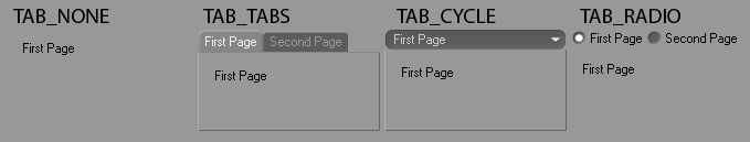
GeDialog.TabGroupBegin(self, id, flags, tabtype=TAB_TABS)¶ Begins a tab group.
- Parameters
id (int) – The ID of the group.
flags (int) –
Layout flags:
BFH_CENTER
Centered horizontally.
BFH_LEFT
Aligned to the left.
BFH_RIGHT
Aligned to the right.
BFH_FIT
Fit horizontally. BFH_LEFT | BFH_RIGHT.
BFH_SCALE
Scale horizontally if there is more space.
BFH_SCALEFIT
Scale fit horizontally. BFH_SCALE | BFH_FIT.
BFH_MASK
Masks out flags.
BFV_CENTER
Centered vertically.
BFV_TOP
Aligned to the top.
BFV_BOTTOM
Aligned to the bottom.
BFV_FIT
Fit. BFV_BOTTOM | BFV_TOP.
BFV_SCALE
Scale vertically if there is more space.
BFV_SCALEFIT
Scale fit vertically. BFV_SCALE | BFV_FIT.
BFV_MASK
Masks out flags.
tabtype (int) –
Specifies what kind of tabs to use:
TAB_TABS
Normal tabs.
TAB_NOSELECT
No tabs.
TAB_CYCLE
Popup buttons instead of tabs.
TAB_RADIO
Radio buttons instead of tabs.
TAB_VLTABS
Vertical tabs, left-sided.
TAB_VRTABS
Vertical tabs, right-sided.
- Return type
bool
- Returns
True if a tab group could be begun, otherwise False.
-
GeDialog.CheckDropArea(self, id, msg, horiz, vert)¶ Checks the drag position in a drag event message against a certain dialog element’s position in the layout.
Note
The check can be limited to only X or Y coordinates.
- Parameters
id (int) – The dialog element that this cursor is for, or 0.
msg (c4d.BaseContainer) – The drag message.
horiz (bool) – If True the drag position is checked against the horizontal bounds of the region.
vert (bool) – If True the drag position is checked against the vertical bounds of the region.
- Return type
bool
- Returns
True if the drag message is within the bounds specified, otherwise False.
-
GeDialog.GetColorRGB(self, colorid)¶ Gets the RGB values associated with a color ID.
- Parameters
colorid (int) – The color ID. See COLOR constants.
- Return type
dict{r: int, g: int, b: int}
- Returns
The color in the dict with the keys r, g and b.
-
GeDialog.GetDragObject(self, msg)¶ Extracts the object from a drag and drop message.
- Parameters
msg (c4d.BaseContainer) – The original message.
- Return type
dict{‘type’: int, ‘object’: any}
- Returns
The type of drag and the object itself. The types are:
DRAGTYPE_ATOMARRAY
Atom array. The data is a list of
c4d.C4DAtom.DRAGTYPE_CMDPALETTE
Not supported.
DRAGTYPE_COMMAND
Not supported.
DRAGTYPE_DESCID
Description ID. The data is a dict(‘did’:
c4d.DescID, ‘arr’: list ofc4d.C4DAtom).DRAGTYPE_ICON
Not supported.
DRAGTYPE_FILES
Files. The data is a string with the filename.
DRAGTYPE_FILENAME_IMAGE
Image. The data is a string with the filename.
DRAGTYPE_FILENAME_OTHER
Other filename. The data is a string with the filename.
DRAGTYPE_FILENAME_SCENE
Scene filename. The data is a string with the filename.
DRAGTYPE_MANAGER
Not supported.
DRAGTYPE_RGB
RGB color. The data is a
c4d.Vector.DRAGTYPE_RGB_ARRAY
RGB color array. The data is a list of
c4d.Vector.DRAGTYPE_RGBA_ARRAY
RGBA color array. The data is a
maxon.BaseArrayofmaxon.ColorA.DRAGTYPE_BROWSER
Browser drag message. The data is a list of string with the filename.
DRAGTYPE_ASSET
New in version 2023.2.0: Message ID for Asset browser assets, the message data is a
maxon.DragAndDropDataAssetArray.
-
GeDialog.GetDragPosition(self, msg)¶ Extracts local drag coordinates from a drag and drop event.
- Parameters
msg (c4d.BaseContainer) – The original message.
- Return type
dict{‘x’: int, ‘y’: int}
- Returns
The local X and Y position.
-
GeDialog.SetDragDestination(self, cursor, gadgetid=0)¶ Sets the correct cursor during drag and drop handling.
- Parameters
cursor (int) –
A mouse cursor:
MOUSE_HIDE
Hide cursor.
MOUSE_SHOW
Show cursor.
MOUSE_NORMAL
Normal cursor.
MOUSE_BUSY
Busy cursor.
MOUSE_CROSS
Cross cursor.
MOUSE_QUESTION
Question cursor
MOUSE_ZOOM_IN
Zoom in cursor.
MOUSE_ZOOM_OUT
Zoom out cursor.
MOUSE_FORBIDDEN
Forbidden cursor.
MOUSE_DELETE
Delete cursor.
MOUSE_COPY
Copy cursor.
MOUSE_INSERTCOPY
Insert copy cursor.
MOUSE_INSERTCOPYDOWN
Insert copy down cursor.
MOUSE_MOVE
Move cursor.
MOUSE_INSERTMOVE
Insert move cursor.
MOUSE_INSERTMOVEDOWN
Insert move cursor.
MOUSE_ARROW_H
Horizontal cursor.
MOUSE_ARROW_V
Vertical cursor.
MOUSE_ARROW_HV
Horizontal and vertical arrow cursor.
MOUSE_POINT_HAND
Point hand cursor.
MOUSE_MOVE_HAND
Move hand cursor.
MOUSE_IBEAM
I-beam cursor.
MOUSE_SELECT_LIVE
Live selection cursor.
MOUSE_SELECT_FREE
Free selection cursor.
MOUSE_SELECT_RECT
Rectangle selection cursor.
MOUSE_SELECT_POLY
Polygon selection cursor.
MOUSE_SPLINETOOLS
Spline tools cursor.
MOUSE_EXTRUDE
Extrude cursor.
MOUSE_NORMALMOVE
Normal move cursor.
MOUSE_ADDPOINTS
Add points cursor.
MOUSE_ADDPOLYGONS
Add polygons cursor.
MOUSE_BRIDGE
Bridge cursor.
MOUSE_MIRROR
Mirror cursor.
MOUSE_PAINTMOVE
Paint move cursor.
MOUSE_PAINTSELECTRECT
Paint select rectangle cursor.
MOUSE_PAINTSELECTCIRCLE
Paint select circle cursor.
MOUSE_PAINTSELECTPOLY
Paint select polygon cursor.
MOUSE_PAINTSELECTFREE
Paint select free cursor.
MOUSE_PAINTMAGICWAND
Paint magic wand cursor.
MOUSE_PAINTCOLORRANGE
Paint color range cursor.
MOUSE_PAINTFILL
Paint fill cursor.
MOUSE_PAINTPICK
Paint pick cursor.
MOUSE_PAINTBRUSH
Paint brush cursor.
MOUSE_PAINTCLONE
Paint clone cursor.
MOUSE_PAINTTEXT
Paint text cursor.
MOUSE_PAINTCROP
Paint crop cursor.
MOUSE_PAINTLINE
Paint line cursor.
MOUSE_PAINTPOLYSHAPE
Paint polygon shape cursor.
gadgetid (int) – The dialog element that this cursor is for, or 0.
- Return type
bool
- Returns
True if the cursor could be set, otherwise False.
-
GeDialog.MenuAddCommand(self, cmdid)¶ - Adds a command item to the current menu.This can either be a Cinema 4D command or a plugin command.
Note
Particularly useful is IDM_CM_CLOSEWINDOW to add a close item for dialogs.
- Parameters
cmdid (int) – A Cinema 4D command id or a plugin ID.
- Return type
bool
- Returns
True if the command was added.
-
GeDialog.MenuAddSeparator(self)¶ Adds a separator to the current menu.
- Return type
bool
- Returns
True if a separator was added.
-
GeDialog.MenuAddString(self, id, string)¶ Adds a string item to the current menu.
Note
Command()will be called when the menu item is selected.- Parameters
id (int) – The item ID.
string (str) – The item text. Use a &d& suffix for disabled and a c suffix for checked items.
- Return type
bool
- Returns
True if the menu item was added, otherwise False.
-
GeDialog.MenuFinished(self)¶ Call this function when all menus and all items have been added.
- Return type
bool
- Returns
True if a separator was added.
-
GeDialog.MenuFlushAll(self)¶ -
Note
Call
MenuFinished()when all menus and items have been added.- Return type
bool
- Returns
True if the menu bar was flushed.
-
GeDialog.MenuInitString(self, id, enabled, value)¶ - Used to change the enabled/disabled and checked/unchecked state of menu items.Can be called after
MenuFinished()to update the menu item dynamically.- Parameters
id (int) – The menu item ID.
enabled (bool) – True if the item is enabled, otherwise False.
value (bool) – True if the menu item should be checked.
- Return type
bool
- Returns
True if the item was set.
-
GeDialog.MenuSetResource(self, id)¶ Sets the menu from a MENU resource ID.
- Parameters
id (int) – The menu resource ID.
- Return type
bool
- Returns
True if the menu was set from resource, otherwise False
-
GeDialog.MenuSubBegin(self, string)¶ - Creates a new menu group.At the top level this means a menu, at lower levels a sub-menu.
Note
Call
MenuSubEnd()when the menu is finished.- Parameters
string (str) – Name of the sub menu.
- Return type
bool
- Returns
True if a menu group could be begun.
-
GeDialog.MenuSubEnd(self)¶ Closes the current menu group, opened with
MenuSubBegin().- Return type
bool
- Returns
True if the menu group was ended, otherwise False.
-
GeDialog.SetDefaultColor(self, id, colorid, color)¶ Set the default color for GUI elements.
- Parameters
id (Union[c4d.gui.C4DGadget, int]) – The control ID.
colorid (int) – The color ID. See COLOR constants.
color (c4d.Vector) – The color.
-
GeDialog.SetFolding(self, allowClose)¶ Fold the dialog away in the layout.
New in version 24.
- Parameters
allowClose (bool) – True if the dialog should fold away.
-
GeDialog.SetTitle(self, title)¶ Sets the title of the dialog window.
- Parameters
title (str) – The title.
-
GeDialog.AddArrowButton(self, id, flags, initw=0, inith=0, arrowtype=0)¶ Adds an arrow button to the layout.
New in version 2023.2.0.
- Parameters
id (int) – The unique ID of the gadget.
flags (int) –
Layout flags:
BFH_CENTER
Centered horizontally.
BFH_LEFT
Aligned to the left.
BFH_RIGHT
Aligned to the right.
BFH_FIT
Fit horizontally. BFH_LEFT | BFH_RIGHT.
BFH_SCALE
Scale horizontally if there is more space.
BFH_SCALEFIT
Scale fit horizontally. BFH_SCALE | BFH_FIT.
BFH_MASK
Masks out flags.
BFV_CENTER
Centered vertically.
BFV_TOP
Aligned to the top.
BFV_BOTTOM
Aligned to the bottom.
BFV_FIT
Fit. BFV_BOTTOM | BFV_TOP.
BFV_SCALE
Scale vertically if there is more space.
BFV_SCALEFIT
Scale fit vertically. BFV_SCALE | BFV_FIT.
BFV_MASK
Masks out flags.
initw (int) – Initial width.
inith (int) – Initial height.
arrowtype (int) –
The arrow type:
Key
Description
ARROW_LEFT
Arrow pointing left.
ARROW_RIGHT
Arrow pointing right.
ARROW_UP
Arrow pointing up.
ARROW_DOWN
Arrow pointing down.
ARROW_SMALL_LEFT
Small arrow pointing left.
ARROW_SMALL_RIGHT
Small arrow pointing right.
ARROW_SMALL_UP
Small arrow pointing up.
ARROW_SMALL_DOWN
Small arrow pointing down.
- Return type
- Returns
The added gadget.
-
GeDialog.AddButton(self, id, flags, initw=0, inith=0, name='')¶ Add a button to the dialog.

- Parameters
id (int) – The unique ID of the dialog.
flags (int) –
Layout flags:
BFH_CENTER
Centered horizontally.
BFH_LEFT
Aligned to the left.
BFH_RIGHT
Aligned to the right.
BFH_FIT
Fit horizontally. BFH_LEFT | BFH_RIGHT.
BFH_SCALE
Scale horizontally if there is more space.
BFH_SCALEFIT
Scale fit horizontally. BFH_SCALE | BFH_FIT.
BFH_MASK
Masks out flags.
BFV_CENTER
Centered vertically.
BFV_TOP
Aligned to the top.
BFV_BOTTOM
Aligned to the bottom.
BFV_FIT
Fit. BFV_BOTTOM | BFV_TOP.
BFV_SCALE
Scale vertically if there is more space.
BFV_SCALEFIT
Scale fit vertically. BFV_SCALE | BFV_FIT.
BFV_MASK
Masks out flags.
initw (int) – Initial width.
inith (int) – Initial height.
name (str) – Name of the button.
- Return type
- Returns
The added gadget.
-
GeDialog.AddCheckbox(self, id, flags, initw, inith, name)¶ Add a checkbox to the dialog.

- Parameters
id (int) – The unique ID of the dialog.
flags (int) –
Layout flags:
BFH_CENTER
Centered horizontally.
BFH_LEFT
Aligned to the left.
BFH_RIGHT
Aligned to the right.
BFH_FIT
Fit horizontally. BFH_LEFT | BFH_RIGHT.
BFH_SCALE
Scale horizontally if there is more space.
BFH_SCALEFIT
Scale fit horizontally. BFH_SCALE | BFH_FIT.
BFH_MASK
Masks out flags.
BFV_CENTER
Centered vertically.
BFV_TOP
Aligned to the top.
BFV_BOTTOM
Aligned to the bottom.
BFV_FIT
Fit. BFV_BOTTOM | BFV_TOP.
BFV_SCALE
Scale vertically if there is more space.
BFV_SCALEFIT
Scale fit vertically. BFV_SCALE | BFV_FIT.
BFV_MASK
Masks out flags.
initw (int) – Initial width.
inith (int) – Initial height.
name (str) – Name of the checkbox option.
- Return type
- Returns
The added gadget.
-
GeDialog.AddChild(self, id, subid, child)¶ Adds items to combo boxes or popup buttons. The resource equivalent is CHILDS.
- Parameters
id (Union[c4d.gui.C4DGadget, int]) – The control ID or int.
subid (int) – ID of the item to add.
child (str) – Name of the item to add.
- Return type
bool
- Returns
True if the child was added.
-
GeDialog.AddColorChooser(self, id, flags, initw=80, inith=0, layoutflags=False, settings=None)¶ Adds a color field with sliders to the layout.
- Parameters
id (int) – The unique ID of the dialog.
flags (int) –
Layout flags:
BFH_CENTER
Centered horizontally.
BFH_LEFT
Aligned to the left.
BFH_RIGHT
Aligned to the right.
BFH_FIT
Fit horizontally. BFH_LEFT | BFH_RIGHT.
BFH_SCALE
Scale horizontally if there is more space.
BFH_SCALEFIT
Scale fit horizontally. BFH_SCALE | BFH_FIT.
BFH_MASK
Masks out flags.
BFV_CENTER
Centered vertically.
BFV_TOP
Aligned to the top.
BFV_BOTTOM
Aligned to the bottom.
BFV_FIT
Fit. BFV_BOTTOM | BFV_TOP.
BFV_SCALE
Scale vertically if there is more space.
BFV_SCALEFIT
Scale fit vertically. BFV_SCALE | BFV_FIT.
BFV_MASK
Masks out flags.
initw (int) – Initial width.
inith (int) – Initial height.
layoutflags (int) –
Flags:
DR_COLORFIELD_NO_BRIGHTNESS
Disables the brightness control.
DR_COLORFIELD_NO_COLOR
Disables the color control.
DR_COLORFIELD_BODYPAINT
Uses the BodyPaint 3D style. Deprecated since R17. Not needed anymore: now just one style.
DR_COLORFIELD_ICC_BASEDOC
Uses the color profile of the current
BaseDocument.DR_COLORFIELD_ICC_BPTEX
Uses the color profile of the current BodyPaint 3D texture.
DR_COLORFIELD_NO_MODE_BUTTONS
New in version R17.032: Hides the color mode buttons.
DR_COLORFIELD_NO_COLORWHEEL
New in version R17.032: Hides the Color Wheel mode button.
DR_COLORFIELD_NO_SPECTRUM
New in version R17.032: Hides the Color Spectrum mode button.
DR_COLORFIELD_NO_PICTURE
New in version R17.032: Hides the Color From Picture mode button.
DR_COLORFIELD_NO_RGB
New in version R17.032: Hides the RGB sliders mode button.
DR_COLORFIELD_NO_HSV
New in version R17.032: Hides the HSV sliders mode button.
DR_COLORFIELD_NO_KELVIN
New in version R17.032: Hides the Kelvin Color Temperature mode button.
DR_COLORFIELD_NO_MIXER
New in version R17.032: Hides the Color Mixer mode button.
DR_COLORFIELD_NO_SWATCHES
New in version R17.032: Hides the Swatches mode button.
DR_COLORFIELD_NO_SCREENPICKER
New in version R17.032: Hides the ScreenPicker mode button.
DR_COLORFIELD_ENABLE_COLORWHEEL
New in version R17.032: Enables the Special Color Wheel mode (Special modes are exclusive each other: use only one at a time).
DR_COLORFIELD_ENABLE_SPECTRUM
New in version R17.032: Enables the Special Color Spectrum mode (Special modes are exclusive each other: use only one at a time).
DR_COLORFIELD_ENABLE_PICTURE
New in version R17.032: Enables the Special Color from Picture mode (Special modes are exclusive each other: use only one at a time).
DR_COLORFIELD_ENABLE_RGB
New in version R17.032: Enables the RGB sliders mode.
DR_COLORFIELD_ENABLE_HSV
New in version R17.032: Enables the HSV sliders mode.
DR_COLORFIELD_ENABLE_KELVIN
New in version R17.032: Enables the Kelvin Color Temperature mode.
DR_COLORFIELD_ENABLE_MIXER
New in version R17.032: Enables the Color Mixer mode.
DR_COLORFIELD_ENABLE_SWATCHES
New in version R17.032: Enables the Swatches mode.
DR_COLORFIELD_RGB_HIDE_HEX
New in version R17.032: Hides the Hexadecimal color field in the RGB Mode.
DR_COLORFIELD_POPUP
New in version R17.032: Private.
settings (Optional[c4d.BaseContainer]) –
Private.
New in version R17.048: The color chooser settings.
- Return type
- Returns
The added gadget.
-
GeDialog.AddColorField(self, id, flags, initw=0, inith=0, colorflags=0)¶ Adds a simple color field without sliders to the layout.

- Parameters
id (int) – The unique ID of the dialog.
flags (int) –
Layout flags:
BFH_CENTER
Centered horizontally.
BFH_LEFT
Aligned to the left.
BFH_RIGHT
Aligned to the right.
BFH_FIT
Fit horizontally. BFH_LEFT | BFH_RIGHT.
BFH_SCALE
Scale horizontally if there is more space.
BFH_SCALEFIT
Scale fit horizontally. BFH_SCALE | BFH_FIT.
BFH_MASK
Masks out flags.
BFV_CENTER
Centered vertically.
BFV_TOP
Aligned to the top.
BFV_BOTTOM
Aligned to the bottom.
BFV_FIT
Fit. BFV_BOTTOM | BFV_TOP.
BFV_SCALE
Scale vertically if there is more space.
BFV_SCALEFIT
Scale fit vertically. BFV_SCALE | BFV_FIT.
BFV_MASK
Masks out flags.
initw (int) – Initial width.
inith (int) – Initial height.
colorflags (int) –
New in version R14.014: Color flags:
DR_COLORFIELD_NO_BRIGHTNESS
Disables the brightness control.
DR_COLORFIELD_NO_COLOR
Disables the color control.
DR_COLORFIELD_BODYPAINT
Uses the BodyPaint 3D style. Deprecated since R17. Not needed anymore: now just one style.
DR_COLORFIELD_ICC_BASEDOC
Uses the color profile of the current
BaseDocument.DR_COLORFIELD_ICC_BPTEX
Uses the color profile of the current BodyPaint 3D texture.
DR_COLORFIELD_NO_MODE_BUTTONS
New in version R17.032: Hides the color mode buttons.
DR_COLORFIELD_NO_COLORWHEEL
New in version R17.032: Hides the Color Wheel mode button.
DR_COLORFIELD_NO_SPECTRUM
New in version R17.032: Hides the Color Spectrum mode button.
DR_COLORFIELD_NO_PICTURE
New in version R17.032: Hides the Color From Picture mode button.
DR_COLORFIELD_NO_RGB
New in version R17.032: Hides the RGB sliders mode button.
DR_COLORFIELD_NO_HSV
New in version R17.032: Hides the HSV sliders mode button.
DR_COLORFIELD_NO_KELVIN
New in version R17.032: Hides the Kelvin Color Temperature mode button.
DR_COLORFIELD_NO_MIXER
New in version R17.032: Hides the Color Mixer mode button.
DR_COLORFIELD_NO_SWATCHES
New in version R17.032: Hides the Swatches mode button.
DR_COLORFIELD_NO_SCREENPICKER
New in version R17.032: Hides the ScreenPicker mode button.
DR_COLORFIELD_ENABLE_COLORWHEEL
New in version R17.032: Enables the Special Color Wheel mode (Special modes are exclusive each other: use only one at a time).
DR_COLORFIELD_ENABLE_SPECTRUM
New in version R17.032: Enables the Special Color Spectrum mode (Special modes are exclusive each other: use only one at a time).
DR_COLORFIELD_ENABLE_PICTURE
New in version R17.032: Enables the Special Color from Picture mode (Special modes are exclusive each other: use only one at a time).
DR_COLORFIELD_ENABLE_RGB
New in version R17.032: Enables the RGB sliders mode.
DR_COLORFIELD_ENABLE_HSV
New in version R17.032: Enables the HSV sliders mode.
DR_COLORFIELD_ENABLE_KELVIN
New in version R17.032: Enables the Kelvin Color Temperature mode.
DR_COLORFIELD_ENABLE_MIXER
New in version R17.032: Enables the Color Mixer mode.
DR_COLORFIELD_ENABLE_SWATCHES
New in version R17.032: Enables the Swatches mode.
DR_COLORFIELD_RGB_HIDE_HEX
New in version R17.032: Hides the Hexadecimal color field in the RGB Mode.
DR_COLORFIELD_POPUP
New in version R17.032: Private.
- Return type
- Returns
The added gadget.
-
GeDialog.AddComboBox(self, id, flags, initw=80, inith=0, specialalign=False, allowfiltering=False)¶ Adds a combo box to the layout.

Note
To add items to the combo box menu use the
AddChild()method.- Parameters
id (int) – The unique ID of the dialog.
flags (int) –
Layout flags:
BFH_CENTER
Centered horizontally.
BFH_LEFT
Aligned to the left.
BFH_RIGHT
Aligned to the right.
BFH_FIT
Fit horizontally. BFH_LEFT | BFH_RIGHT.
BFH_SCALE
Scale horizontally if there is more space.
BFH_SCALEFIT
Scale fit horizontally. BFH_SCALE | BFH_FIT.
BFH_MASK
Masks out flags.
BFV_CENTER
Centered vertically.
BFV_TOP
Aligned to the top.
BFV_BOTTOM
Aligned to the bottom.
BFV_FIT
Fit. BFV_BOTTOM | BFV_TOP.
BFV_SCALE
Scale vertically if there is more space.
BFV_SCALEFIT
Scale fit vertically. BFV_SCALE | BFV_FIT.
BFV_MASK
Masks out flags.
initw (int) – Initial width.
inith (int) – Initial height.
specialalign (bool) –
Used to quantize the width of the combo box.If this is True then the width of the combo box will be a multiple of initw.For example if initw is 60px and specialalign is True the width will be 60, 120, 180px and so on.allowfiltering (bool) –
New in version R21: True to allow keyboard filtering of the combobox list.
- Return type
- Returns
The added gadget.
-
GeDialog.AddComboButton(self, id, flags, initw=0, inith=0, specialalign=False, allowfiltering=False)¶ Adds a combo button to the layout.
New in version 2023.2.0.
Note
To add items to the combo box menu use the
AddChild()method.- Parameters
id (int) – The unique ID of the dialog.
flags (int) –
Layout flags:
BFH_CENTER
Centered horizontally.
BFH_LEFT
Aligned to the left.
BFH_RIGHT
Aligned to the right.
BFH_FIT
Fit horizontally. BFH_LEFT | BFH_RIGHT.
BFH_SCALE
Scale horizontally if there is more space.
BFH_SCALEFIT
Scale fit horizontally. BFH_SCALE | BFH_FIT.
BFH_MASK
Masks out flags.
BFV_CENTER
Centered vertically.
BFV_TOP
Aligned to the top.
BFV_BOTTOM
Aligned to the bottom.
BFV_FIT
Fit. BFV_BOTTOM | BFV_TOP.
BFV_SCALE
Scale vertically if there is more space.
BFV_SCALEFIT
Scale fit vertically. BFV_SCALE | BFV_FIT.
BFV_MASK
Masks out flags.
initw (int) – Initial width.
inith (int) – Initial height.
specialalign (bool) –
Used to quantize the width of the combo box.If this is True then the width of the combo box will be a multiple of initw.For example if initw is 60px and specialalign is True the width will be 60, 120, 180px and so on.allowfiltering (bool) –
New in version R21: True to allow keyboard filtering of the combobox list.
- Return type
- Returns
The added gadget.
-
GeDialog.AddCustomGui(self, id, pluginid, name, flags, minw, minh, customdata)¶ Adds a custom GUI to the dialog.
- Parameters
id (int) – The ID of the custom GUI to add.
pluginid (int) –
The plugin ID of the custom GUI.
Symbol ID
Value Type
Description
CUSTOMGUI_REAL
Float
Edit field.
CUSTOMGUI_REALSLIDER
Float
Edit field with slider.
CUSTOMGUI_REALSLIDERONLY
Float
Slider only.
CUSTOMGUI_VECTOR
c4d.Vector
Vector
CUSTOMGUI_VECTOR4D
c4d.Vector4D
Vector 4D.
CUSTOMGUI_STRING
str
String field.
CUSTOMGUI_STRINGMULTI
str
Multiple line string field.
CUSTOMGUI_STATICTEXT
str
Static text field.
CUSTOMGUI_CYCLE
int
Selection list field.
CUSTOMGUI_CYCLEBUTTON
int
Selection field list with button functionality, e.g. the function of a button can be changed through a selection field list.
CUSTOMGUI_LONG
int
Edit field.
CUSTOMGUI_LONGSLIDER
int
Edit field with slider.
CUSTOMGUI_BOOL
bool
Checkbox.
CUSTOMGUI_TIME
c4d.BaseTime
Time edit field.
CUSTOMGUI_COLOR
c4d.Vector
Color chooser.
CUSTOMGUI_MATRIX
c4d.Matrix
Matrix edit fields.
CUSTOMGUI_BUTTON
bool
Button.
CUSTOMGUI_POPUP
None
Popup field.
CUSTOMGUI_SEPARATOR
None
Separator.
CUSTOMGUI_SUBDESCRIPTION
None
Sub-description.
CUSTOMGUI_PROGRESSBAR
None
Progress bar.
name (str) – The name of the added custom GUI. (Not necessarily used.)
flags (int) –
Layout flags:
BFH_CENTER
Centered horizontally.
BFH_LEFT
Aligned to the left.
BFH_RIGHT
Aligned to the right.
BFH_FIT
Fit horizontally. BFH_LEFT | BFH_RIGHT.
BFH_SCALE
Scale horizontally if there is more space.
BFH_SCALEFIT
Scale fit horizontally. BFH_SCALE | BFH_FIT.
BFH_MASK
Masks out flags.
BFV_CENTER
Centered vertically.
BFV_TOP
Aligned to the top.
BFV_BOTTOM
Aligned to the bottom.
BFV_FIT
Fit. BFV_BOTTOM | BFV_TOP.
BFV_SCALE
Scale vertically if there is more space.
BFV_SCALEFIT
Scale fit vertically. BFV_SCALE | BFV_FIT.
BFV_MASK
Masks out flags.
minw (int) – Minimum width.
minh (int) – Minimum height.
customdata (c4d.BaseContainer) – Container with settings for the custom GUI element.
- Return type
Optional[c4d.gui.BaseCustomGui]
- Returns
The custom GUI that was added, or None if an error occured.
Changed in version R18.057:The method returns aBaseCustomGuiwhen there is no class available for the custom GUI.This allows to interact with any custom GUI, calling for instanceBaseCustomGui.GetData()/SetData().
-
GeDialog.AddDlgGroup(self, type)¶ Adds a dialog group with standard buttons to the layout.
Note
The dialog group contains the standard buttons of a modal dialog (OK and Cancel).By having these grouped together in a single element, Cinema 4D can change the ordering and alignment of the buttons to suit the operation system used.The id of the button will be the same as the type used in the type parameter. This allow, in the dialog’s command function, to check which button have been pressed.- Parameters
type (int) –
Specifies what standard buttons to include. Can be a combination of:
DLG_OK
OK button.
DLG_CANCEL
Cancel button.
- Return type
bool
- Returns
True if the dialog group was added, otherwise False.
-
GeDialog.AddEditNumber(self, id, flags, initw=80, inith=0)¶ Adds an editable number field to the layout.

- Parameters
id (int) – The unique ID of the dialog.
flags (int) –
Layout flags:
BFH_CENTER
Centered horizontally.
BFH_LEFT
Aligned to the left.
BFH_RIGHT
Aligned to the right.
BFH_FIT
Fit horizontally. BFH_LEFT | BFH_RIGHT.
BFH_SCALE
Scale horizontally if there is more space.
BFH_SCALEFIT
Scale fit horizontally. BFH_SCALE | BFH_FIT.
BFH_MASK
Masks out flags.
BFV_CENTER
Centered vertically.
BFV_TOP
Aligned to the top.
BFV_BOTTOM
Aligned to the bottom.
BFV_FIT
Fit. BFV_BOTTOM | BFV_TOP.
BFV_SCALE
Scale vertically if there is more space.
BFV_SCALEFIT
Scale fit vertically. BFV_SCALE | BFV_FIT.
BFV_MASK
Masks out flags.
initw (int) – Initial width.
inith (int) – Initial height.
- Return type
- Returns
The added gadget.
-
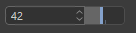
GeDialog.AddEditNumberArrows(self, id, flags, initw=70, inith=0)¶ Adds an editable number field with up/down arrows to the layout.

- Parameters
id (int) – The unique ID of the dialog.
flags (int) –
Layout flags:
BFH_CENTER
Centered horizontally.
BFH_LEFT
Aligned to the left.
BFH_RIGHT
Aligned to the right.
BFH_FIT
Fit horizontally. BFH_LEFT | BFH_RIGHT.
BFH_SCALE
Scale horizontally if there is more space.
BFH_SCALEFIT
Scale fit horizontally. BFH_SCALE | BFH_FIT.
BFH_MASK
Masks out flags.
BFV_CENTER
Centered vertically.
BFV_TOP
Aligned to the top.
BFV_BOTTOM
Aligned to the bottom.
BFV_FIT
Fit. BFV_BOTTOM | BFV_TOP.
BFV_SCALE
Scale vertically if there is more space.
BFV_SCALEFIT
Scale fit vertically. BFV_SCALE | BFV_FIT.
BFV_MASK
Masks out flags.
initw (int) – Initial width.
inith (int) – Initial height.
- Return type
- Returns
The added gadget.
-
GeDialog.AddEditShortcut(self, id, flags, initw=80, inith=0, shortcutflags=0)¶ Adds a field for editing shortcuts.
New in version 2023.2.0.
- Parameters
id (int) – The unique ID of the gadget.
flags (int) –
Layout flags:
BFH_CENTER
Centered horizontally.
BFH_LEFT
Aligned to the left.
BFH_RIGHT
Aligned to the right.
BFH_FIT
Fit horizontally. BFH_LEFT | BFH_RIGHT.
BFH_SCALE
Scale horizontally if there is more space.
BFH_SCALEFIT
Scale fit horizontally. BFH_SCALE | BFH_FIT.
BFH_MASK
Masks out flags.
BFV_CENTER
Centered vertically.
BFV_TOP
Aligned to the top.
BFV_BOTTOM
Aligned to the bottom.
BFV_FIT
Fit. BFV_BOTTOM | BFV_TOP.
BFV_SCALE
Scale vertically if there is more space.
BFV_SCALEFIT
Scale fit vertically. BFV_SCALE | BFV_FIT.
BFV_MASK
Masks out flags.
initw (int) – Initial width.
inith (int) – Initial height.
shortcutflags (int) – The shortcut flags.
- Return type
- Returns
The added gadget.
-
GeDialog.AddEditSlider(self, id, flags, initw=80, inith=0)¶ Adds a slider with an editable number field to the layout.
- Parameters
id (int) – The unique ID of the dialog.
flags (int) –
Layout flags:
BFH_CENTER
Centered horizontally.
BFH_LEFT
Aligned to the left.
BFH_RIGHT
Aligned to the right.
BFH_FIT
Fit horizontally. BFH_LEFT | BFH_RIGHT.
BFH_SCALE
Scale horizontally if there is more space.
BFH_SCALEFIT
Scale fit horizontally. BFH_SCALE | BFH_FIT.
BFH_MASK
Masks out flags.
BFV_CENTER
Centered vertically.
BFV_TOP
Aligned to the top.
BFV_BOTTOM
Aligned to the bottom.
BFV_FIT
Fit. BFV_BOTTOM | BFV_TOP.
BFV_SCALE
Scale vertically if there is more space.
BFV_SCALEFIT
Scale fit vertically. BFV_SCALE | BFV_FIT.
BFV_MASK
Masks out flags.
initw (int) – Initial width.
inith (int) – Initial height.
- Return type
- Returns
The added gadget.
-
GeDialog.AddEditText(self, id, flags, initw=0, inith=0, editflags=0)¶ Adds an editable text field to the layout.

- Parameters
id (int) – The unique ID of the dialog.
flags (int) –
Layout flags:
BFH_CENTER
Centered horizontally.
BFH_LEFT
Aligned to the left.
BFH_RIGHT
Aligned to the right.
BFH_FIT
Fit horizontally. BFH_LEFT | BFH_RIGHT.
BFH_SCALE
Scale horizontally if there is more space.
BFH_SCALEFIT
Scale fit horizontally. BFH_SCALE | BFH_FIT.
BFH_MASK
Masks out flags.
BFV_CENTER
Centered vertically.
BFV_TOP
Aligned to the top.
BFV_BOTTOM
Aligned to the bottom.
BFV_FIT
Fit. BFV_BOTTOM | BFV_TOP.
BFV_SCALE
Scale vertically if there is more space.
BFV_SCALEFIT
Scale fit vertically. BFV_SCALE | BFV_FIT.
BFV_MASK
Masks out flags.
initw (int) – Initial width.
inith (int) – Initial height.
editflags (int) –
Edit flags:
Symbol ID
Description
EDITTEXT_PASSWORD
Password field.
EDITTEXT_HELPTEXT
Sets the help text for an edit field. This text appears if the edit field is empty.
EDITTEXT_IGNORELEFTRIGHTIFEMPTY
Ignore Left Right Keys if edit field is empty.
EDITTEXT_CURSORUPDOWNBUTTONS
Displays a clear button within the edit field
EDITTEXT_ENABLECLEARBUTTON
Returns messages if cursor up/down is pressed (BFM_ACTION_KEYUP, BFM_ACTION_KEYDOWN)
- Return type
- Returns
The added gadget.
-
GeDialog.AddGadget(self, type, gadget)¶ Add a gadget to the dialog.
Several one can be useful:
c4d.DIALOG_NOMENUBAR to disables the menu bar.
c4d. DIALOG_PIN to add the ability to dock the GeDialog.
- Parameters
type (int) – The gadget type ID.
gadget (int) – The gadget ID.
- Returns
Success of the addition of the Gadget.
- Return type
bool
-
GeDialog.AddMultiLineEditText(self, id, flags, initw=0, inith=0, style=0)¶ Adds an editable text field with multiple lines to the layout.
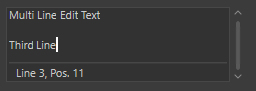
- Parameters
id (int) – The unique ID of the dialog.
flags (int) –
Layout flags:
BFH_CENTER
Centered horizontally.
BFH_LEFT
Aligned to the left.
BFH_RIGHT
Aligned to the right.
BFH_FIT
Fit horizontally. BFH_LEFT | BFH_RIGHT.
BFH_SCALE
Scale horizontally if there is more space.
BFH_SCALEFIT
Scale fit horizontally. BFH_SCALE | BFH_FIT.
BFH_MASK
Masks out flags.
BFV_CENTER
Centered vertically.
BFV_TOP
Aligned to the top.
BFV_BOTTOM
Aligned to the bottom.
BFV_FIT
Fit. BFV_BOTTOM | BFV_TOP.
BFV_SCALE
Scale vertically if there is more space.
BFV_SCALEFIT
Scale fit vertically. BFV_SCALE | BFV_FIT.
BFV_MASK
Masks out flags.
initw (int) – Initial width.
inith (int) – Initial height.
style (int) –
A combination of the following flags:
Symbol ID
Description
DR_MULTILINE_MONOSPACED
Monospaced font.
DR_MULTILINE_SYNTAXCOLOR
Python syntax highlighting.
DR_MULTILINE_STATUSBAR
Display a status bar with the cursor position.
DR_MULTILINE_HIGHLIGHTLINE
Highlight lines.
DR_MULTILINE_READONLY
Read-only multi-line field.
DR_MULTILINE_PYTHON
Python line return handling.
DR_MULTILINE_WORDWRAP
Word-warp multi line field.
DR_MULTILINE_NO_DARK_BACKGROUND
New in version S22: Uses not dark but normal background color
DR_MULTILINE_NO_BORDER
New in version S22: No border
DR_MULTILINE_NO_SCROLLBARS
New in version S22: Shows all the text without scrollbars.
DR_MULTILINE_BOLD
New in version S22: Bold font.
- Return type
- Returns
The added gadget.
-
GeDialog.AddPopupButton(self, id, flags, initw=0, inith=0)¶ Adds a popup button to the layout.

Note
To add items to the popup menu use
AddChild()orSetPopup().New in version R19.
- Parameters
id (int) – The unique ID of the dialog.
flags (int) –
Layout flags:
BFH_CENTER
Centered horizontally.
BFH_LEFT
Aligned to the left.
BFH_RIGHT
Aligned to the right.
BFH_FIT
Fit horizontally. BFH_LEFT | BFH_RIGHT.
BFH_SCALE
Scale horizontally if there is more space.
BFH_SCALEFIT
Scale fit horizontally. BFH_SCALE | BFH_FIT.
BFH_MASK
Masks out flags.
BFV_CENTER
Centered vertically.
BFV_TOP
Aligned to the top.
BFV_BOTTOM
Aligned to the bottom.
BFV_FIT
Fit. BFV_BOTTOM | BFV_TOP.
BFV_SCALE
Scale vertically if there is more space.
BFV_SCALEFIT
Scale fit vertically. BFV_SCALE | BFV_FIT.
BFV_MASK
Masks out flags.
initw (int) – Initial width.
inith (int) – Initial height.
- Return type
- Returns
The added gadget.
-
GeDialog.AddRadioButton(self, id, flags, initw=80, inith=0, name='')¶ Adds a radio button to the layout.
- Parameters
id (int) – The unique ID of the dialog.
flags (int) –
Layout flags:
BFH_CENTER
Centered horizontally.
BFH_LEFT
Aligned to the left.
BFH_RIGHT
Aligned to the right.
BFH_FIT
Fit horizontally. BFH_LEFT | BFH_RIGHT.
BFH_SCALE
Scale horizontally if there is more space.
BFH_SCALEFIT
Scale fit horizontally. BFH_SCALE | BFH_FIT.
BFH_MASK
Masks out flags.
BFV_CENTER
Centered vertically.
BFV_TOP
Aligned to the top.
BFV_BOTTOM
Aligned to the bottom.
BFV_FIT
Fit. BFV_BOTTOM | BFV_TOP.
BFV_SCALE
Scale vertically if there is more space.
BFV_SCALEFIT
Scale fit vertically. BFV_SCALE | BFV_FIT.
BFV_MASK
Masks out flags.
initw (int) – Initial width.
inith (int) – Initial height.
name (str) – Name of the radio button.
- Return type
- Returns
The added gadget.
-
GeDialog.AddRadioGroup(self, id, flags=0, columns=0, rows=0)¶ Adds a radio group to the layout.
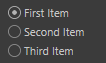
Note
To add items to the radio button group use the
AddChild()function.- Parameters
id (int) – The control ID.
flags (int) –
Layout flags:
BFH_CENTER
Centered horizontally.
BFH_LEFT
Aligned to the left.
BFH_RIGHT
Aligned to the right.
BFH_FIT
Fit horizontally. BFH_LEFT | BFH_RIGHT.
BFH_SCALE
Scale horizontally if there is more space.
BFH_SCALEFIT
Scale fit horizontally. BFH_SCALE | BFH_FIT.
BFH_MASK
Masks out flags.
BFV_CENTER
Centered vertically.
BFV_TOP
Aligned to the top.
BFV_BOTTOM
Aligned to the bottom.
BFV_FIT
Fit. BFV_BOTTOM | BFV_TOP.
BFV_SCALE
Scale vertically if there is more space.
BFV_SCALEFIT
Scale fit vertically. BFV_SCALE | BFV_FIT.
BFV_MASK
Masks out flags.
columns (int) – Number of columns, or 0 if rows is used.
rows (int) – Number of rows, or 0 if columns is used.
- Return type
bool
- Returns
True if the radio group was added, otherwise False.
-
GeDialog.AddRadioText(self, id, flags, initw=80, inith=0, name='')¶ Adds a text radio button to the layout (like the ones to the left in the Cinema 4D material editor).

- Parameters
id (int) – The unique ID of the dialog.
flags (int) –
Layout flags:
BFH_CENTER
Centered horizontally.
BFH_LEFT
Aligned to the left.
BFH_RIGHT
Aligned to the right.
BFH_FIT
Fit horizontally. BFH_LEFT | BFH_RIGHT.
BFH_SCALE
Scale horizontally if there is more space.
BFH_SCALEFIT
Scale fit horizontally. BFH_SCALE | BFH_FIT.
BFH_MASK
Masks out flags.
BFV_CENTER
Centered vertically.
BFV_TOP
Aligned to the top.
BFV_BOTTOM
Aligned to the bottom.
BFV_FIT
Fit. BFV_BOTTOM | BFV_TOP.
BFV_SCALE
Scale vertically if there is more space.
BFV_SCALEFIT
Scale fit vertically. BFV_SCALE | BFV_FIT.
BFV_MASK
Masks out flags.
initw (int) – Initial width.
inith (int) – Initial height.
name (str) – Name of the text radio button.
- Return type
- Returns
The added gadget.
-
GeDialog.AddSeparatorH(self, initw, flags=BFH_FIT)¶ Adds a horizontal separator to the layout.
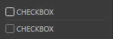
- Parameters
initw (int) – Initial width.
flags (int) –
Layout flags:
BFH_CENTER
Centered horizontally.
BFH_LEFT
Aligned to the left.
BFH_RIGHT
Aligned to the right.
BFH_FIT
Fit horizontally. BFH_LEFT | BFH_RIGHT.
BFH_SCALE
Scale horizontally if there is more space.
BFH_SCALEFIT
Scale fit horizontally. BFH_SCALE | BFH_FIT.
BFH_MASK
Masks out flags.
BFV_CENTER
Centered vertically.
BFV_TOP
Aligned to the top.
BFV_BOTTOM
Aligned to the bottom.
BFV_FIT
Fit. BFV_BOTTOM | BFV_TOP.
BFV_SCALE
Scale vertically if there is more space.
BFV_SCALEFIT
Scale fit vertically. BFV_SCALE | BFV_FIT.
BFV_MASK
Masks out flags.
- Return type
- Returns
The added gadget.
-
GeDialog.AddSeparatorV(self, inith, flags=BFH_FIT)¶ Adds a vertical separator to the layout.
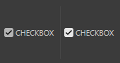
- Parameters
inith (int) – Initial width.
flags (int) –
Layout flags:
BFH_CENTER
Centered horizontally.
BFH_LEFT
Aligned to the left.
BFH_RIGHT
Aligned to the right.
BFH_FIT
Fit horizontally. BFH_LEFT | BFH_RIGHT.
BFH_SCALE
Scale horizontally if there is more space.
BFH_SCALEFIT
Scale fit horizontally. BFH_SCALE | BFH_FIT.
BFH_MASK
Masks out flags.
BFV_CENTER
Centered vertically.
BFV_TOP
Aligned to the top.
BFV_BOTTOM
Aligned to the bottom.
BFV_FIT
Fit. BFV_BOTTOM | BFV_TOP.
BFV_SCALE
Scale vertically if there is more space.
BFV_SCALEFIT
Scale fit vertically. BFV_SCALE | BFV_FIT.
BFV_MASK
Masks out flags.
- Return type
- Returns
The added gadget.
-
GeDialog.AddSlider(self, id, flags, initw=90, inith=0)¶ Adds a slider to the layout.

- Parameters
id (int) – The unique ID of the dialog.
flags (int) –
Layout flags:
BFH_CENTER
Centered horizontally.
BFH_LEFT
Aligned to the left.
BFH_RIGHT
Aligned to the right.
BFH_FIT
Fit horizontally. BFH_LEFT | BFH_RIGHT.
BFH_SCALE
Scale horizontally if there is more space.
BFH_SCALEFIT
Scale fit horizontally. BFH_SCALE | BFH_FIT.
BFH_MASK
Masks out flags.
BFV_CENTER
Centered vertically.
BFV_TOP
Aligned to the top.
BFV_BOTTOM
Aligned to the bottom.
BFV_FIT
Fit. BFV_BOTTOM | BFV_TOP.
BFV_SCALE
Scale vertically if there is more space.
BFV_SCALEFIT
Scale fit vertically. BFV_SCALE | BFV_FIT.
BFV_MASK
Masks out flags.
initw (int) – Initial width.
inith (int) – Initial height.
- Return type
- Returns
The added gadget.
-
GeDialog.AddStaticText(self, id, flags, initw=0, inith=0, name='', borderstyle=0)¶ Adds a static text field to the layout.
- Parameters
id (int) – The unique ID of the dialog.
flags (int) –
Layout flags:
BFH_CENTER
Centered horizontally.
BFH_LEFT
Aligned to the left.
BFH_RIGHT
Aligned to the right.
BFH_FIT
Fit horizontally. BFH_LEFT | BFH_RIGHT.
BFH_SCALE
Scale horizontally if there is more space.
BFH_SCALEFIT
Scale fit horizontally. BFH_SCALE | BFH_FIT.
BFH_MASK
Masks out flags.
BFV_CENTER
Centered vertically.
BFV_TOP
Aligned to the top.
BFV_BOTTOM
Aligned to the bottom.
BFV_FIT
Fit. BFV_BOTTOM | BFV_TOP.
BFV_SCALE
Scale vertically if there is more space.
BFV_SCALEFIT
Scale fit vertically. BFV_SCALE | BFV_FIT.
BFV_MASK
Masks out flags.
initw (int) – Initial width.
inith (int) – Initial height.
name (str) – Name of the button.
borderstyle (int) –
Border style:
BORDER_NONE
No border.
BORDER_THIN_IN
Thin border inward.
BORDER_THIN_OUT
Thin border outward.
BORDER_IN
Normal border inward.
BORDER_OUT
Normal border outward.
BORDER_GROUP_IN
Group border inside.
BORDER_GROUP_OUT
Group border outside.
BORDER_OUT2
Outward border 2.
BORDER_OUT3
Outward border 3
BORDER_BLACK
Thin black line.
BORDER_ACTIVE_1
Active border 1.
BORDER_ACTIVE_2
Active border 2.
BORDER_ACTIVE_3
Active border 3.
BORDER_ACTIVE_4
Active border 4.
BORDER_GROUP_TOP
Border along the top.
BORDER_ROUND
Border with round corners.
BORDER_SCHEME_EDIT
Edit field border like the shortcut gadget for example.
BORDER_SCHEME_EDIT_NUMERIC
Edit field border that is open to the right like the link field for example.
BORDER_OUT3l
Outward border 3, open to the left.
BORDER_OUT3r
Outward border 3, open to the right.
BORDER_THIN_INb
Thin border inward, open to the botton.
BORDER_MASK
Masks out border type.
BORDER_TEXT_DOTTED
New in version R21:Only used withGeDialog.AddStaticText().Draws a dotted line at right of text, useful to visually connect the text with its parameter.BORDER_WITH_TITLE_MONO
Display group title with monospaced font.
BORDER_WITH_TITLE_BOLD
Display group title with bold font.
BORDER_WITH_TITLE
Display group title in the border.
- Return type
- Returns
The added gadget.
-
GeDialog.AddSubDialog(self, id, flags, initw=0, inith=0)¶ Adds a sub-dialog to the layout.
Note
Use
AttachSubDialog()to assign ac4d.gui.SubDialogobject to the sub-dialog control.New in version R19.
- Parameters
id (int) – The sub-dialog ID.
flags (int) –
BFH_CENTER
Centered horizontally.
BFH_LEFT
Aligned to the left.
BFH_RIGHT
Aligned to the right.
BFH_FIT
Fit horizontally. BFH_LEFT | BFH_RIGHT.
BFH_SCALE
Scale horizontally if there is more space.
BFH_SCALEFIT
Scale fit horizontally. BFH_SCALE | BFH_FIT.
BFH_MASK
Masks out flags.
BFV_CENTER
Centered vertically.
BFV_TOP
Aligned to the top.
BFV_BOTTOM
Aligned to the bottom.
BFV_FIT
Fit. BFV_BOTTOM | BFV_TOP.
BFV_SCALE
Scale vertically if there is more space.
BFV_SCALEFIT
Scale fit vertically. BFV_SCALE | BFV_FIT.
BFV_MASK
Masks out flags.
initw (int) – Initial width.
inith (int) – Initial height.
- Return type
bool
- Returns
True if the sub-dialog was added, otherwise False.
-
GeDialog.AddUserArea(self, id, flags, initw=0, inith=0)¶ Adds a user area to the layout.
Note
Use
AttachUserArea()to assign aGeUserAreaobject to the user area control.- Parameters
id (int) – The user area ID.
flags (int) –
BFH_CENTER
Centered horizontally.
BFH_LEFT
Aligned to the left.
BFH_RIGHT
Aligned to the right.
BFH_FIT
Fit horizontally. BFH_LEFT | BFH_RIGHT.
BFH_SCALE
Scale horizontally if there is more space.
BFH_SCALEFIT
Scale fit horizontally. BFH_SCALE | BFH_FIT.
BFH_MASK
Masks out flags.
BFV_CENTER
Centered vertically.
BFV_TOP
Aligned to the top.
BFV_BOTTOM
Aligned to the bottom.
BFV_FIT
Fit. BFV_BOTTOM | BFV_TOP.
BFV_SCALE
Scale vertically if there is more space.
BFV_SCALEFIT
Scale fit vertically. BFV_SCALE | BFV_FIT.
BFV_MASK
Masks out flags.
initw (int) – Initial width.
inith (int) – Initial height.
- Return type
- Returns
The added gadget.
-
GeDialog.CheckClose(self)¶ Checks if the dialog can be closed. Normally checks the value ranges and calls
GeDialog.AskClose().New in version 2023.2.0.
- Return type
bool
- Returns
True if the dialog should not be closed, otherwise False.
-
GeDialog.CheckCoreMessage(self, msg)¶ Speedup function that checks if a core message is new or has been already processed.
New in version 2023.2.0.
- Parameters
msg (c4d.BaseContainer) – The core message.
- Return type
bool
- Returns
True if the message is new, False if it is a message of the same age.
-
GeDialog.CheckTristateChange(self, id)¶ Indicates whatever a control’s content has been changed since the last time its value was set manually with.
- Parameters
id (Union[c4d.gui.C4DGadget, int]) – The control ID or int.
- Return type
bool
- Returns
True if the control has been changed, otherwise False.
-
GeDialog.CheckValueRanges(self)¶ Checks if the value for all input fields are within the allowed range.
- Return type
bool
- Returns
True if everything is alright, or False if any field is wrong.
-
GeDialog.GetPixelRatio(self)¶ Always returns 1.0 except for user areas shown on OS X Retina displays, where it returns 2.0.
New in version 2023.2.0.
- Return type
float
- Returns
Always 1.0 except for user areas shown on OS X Retina displays.
-
GeDialog.IsEnabled(self, id)¶ Checks if a dialog item is enabled.
New in version 2023.2.0.
- Parameters
id (Union[c4d.gui.C4DGadget, int]) – The control ID or int.
- Return type
bool
- Returns
True if the dialog item is enabled, otherwise False.
-
GeDialog.FindCustomGui(self, id, pluginid)¶ Get the custom GUI for a certain ID.
Note
The GUI object must have been previously added with
AddCustomGui().- Parameters
id (int) – The ID of the custom GUI.
pluginid (int) –
The plugin ID of the custom GUI.
Symbol ID
Value Type
Description
CUSTOMGUI_REAL
Float
Edit field.
CUSTOMGUI_REALSLIDER
Float
Edit field with slider.
CUSTOMGUI_REALSLIDERONLY
Float
Slider only.
CUSTOMGUI_VECTOR
c4d.Vector
Vector
CUSTOMGUI_VECTOR4D
c4d.Vector4D
Vector 4D.
CUSTOMGUI_STRING
str
String field.
CUSTOMGUI_STRINGMULTI
str
Multiple line string field.
CUSTOMGUI_STATICTEXT
str
Static text field.
CUSTOMGUI_CYCLE
int
Selection list field.
CUSTOMGUI_CYCLEBUTTON
int
Selection field list with button functionality, e.g. the function of a button can be changed through a selection field list.
CUSTOMGUI_LONG
int
Edit field.
CUSTOMGUI_LONGSLIDER
int
Edit field with slider.
CUSTOMGUI_BOOL
bool
Checkbox.
CUSTOMGUI_TIME
c4d.BaseTime
Time edit field.
CUSTOMGUI_COLOR
c4d.Vector
Color chooser.
CUSTOMGUI_MATRIX
c4d.Matrix
Matrix edit fields.
CUSTOMGUI_BUTTON
bool
Button.
CUSTOMGUI_POPUP
None
Popup field.
CUSTOMGUI_SEPARATOR
None
Separator.
CUSTOMGUI_SUBDESCRIPTION
None
Sub-description.
CUSTOMGUI_PROGRESSBAR
None
Progress bar.
- Return type
Optional[c4d.gui.BaseCustomGui]
- Returns
The found custom GUI, or None if it could not be retrieved.
Changed in version R18.057:The method returns aBaseCustomGuiwhen there is no class available for the custom GUI.This allows to interact with any custom GUI, calling for instanceBaseCustomGui.GetData()/SetData().
-
GeDialog.GetBool(self, id)¶ Retrieves the value of checkbox controls.
- Parameters
id (Union[c4d.gui.C4DGadget, int]) – The control ID or int.
- Return type
Optional[bool]
- Returns
The value or None if the value was not retrieved.
-
GeDialog.GetColorField(self, id)¶ Retrieves the color and brightness of color controls.
- Parameters
id (Union[c4d.gui.C4DGadget, int]) – The control ID or int.
- Return type
Optional[Dict[brightness: float, color: c4d.Vector]]
- Returns
The value or None if the value was not retrieved.
-
GeDialog.GetFilename(self, id)¶ Retrieves the text from string controls as a filename.
- Parameters
id (Union[c4d.gui.C4DGadget, int]) – The control ID or int.
- Return type
Optional[str]
- Returns
The time or None if the value was not retrieved.
-
GeDialog.GetFloat(self, id)¶ Retrieves the value of float fields.
New in version R15.037.
- Parameters
id (Union[c4d.gui.C4DGadget, int]) – The control ID or int.
- Return type
Optional[float]
- Returns
The value or None if the value was not retrieved.
-
GeDialog.GetInt32(self, id)¶ Retrieves the value of integer fields.
New in version R15.037.
Note
Also used for tab groups, radio buttons and combo boxes.
- Parameters
id (Union[c4d.gui.C4DGadget, int]) – The control ID or int.
- Return type
Optional[int]
- Returns
The value or None if the value was not retrieved.
-
GeDialog.GetString(self, id)¶ - Retrieves the text from string controls.Used for all controls that have a text, for example static text fields, edit fields, buttons and checkboxes.
- Parameters
id (Union[c4d.gui.C4DGadget, int]) – The control ID or int.
- Return type
Optional[str]
- Returns
The value or None if the value was not retrieved.
-
GeDialog.GetTime(self, id, doc)¶ Retrieves the time of time fields.
- Parameters
id (Union[c4d.gui.C4DGadget, int]) – The control ID or int.
doc (c4d.documents.BaseDocument) – The document.
- Return type
Optional[c4d.BaseTime]
- Returns
The time or None if the value was not retrieved.
-
GeDialog.GetVector(self, id_x, id_y, id_z)¶ Retrieves the value of three float fields at the same time as a vector.
- Parameters
id_x (Union[c4d.gui.C4DGadget, int]) – The control ID of the X field.
id_y (Union[c4d.gui.C4DGadget, int]) – The control ID of the Y field.
id_z (Union[c4d.gui.C4DGadget, int]) – The control ID of the Z field.
- Return type
Optional[c4d.Vector]
- Returns
The value or None if the value was not retrieved.
-
GeDialog.GetItemDim(self, id)¶ - Queries a dialog control for its current position and size in pixels.Note that this method does take the scrollbars of a gadget into account while
GeDialog.SetVisibleArea()will not. SeeGeDialog.SetVisibleArea()for more information on how to compensate for that.- Parameters
id (Union[c4d.gui.C4DGadget, int]) – The control ID.
- Return type
Dict[‘x’: int, ‘y’: int, ‘w’: int, ‘h’: int]
- Returns
A dictionary with the X/Y coordinates of the upper left corner and the width/height of the control.
-
GeDialog.Activate(self, id)¶ Sets the focus to a specific control within the dialog.
- Parameters
id (int) – The control ID.
- Return type
bool
- Returns
True if the control was activated.
-
GeDialog.AddChildren(self, id, bc)¶ Adds children to a dialog element using a container.
New in version R19.
- Parameters
id (int) – The control ID.
bc (c4d.BaseContainer) – A container with the children to set.
- Return type
bool
- Returns
True if the children were added, otherwise False.
-
GeDialog.AttachSubDialog(self, userdlg, id)¶ - Attaches a
c4d.gui.SubDialogderived object to a sub-dialog control, added withAddSubDialog().To replace the sub-dialog with another one, just call this function again.New in version R19.
- Parameters
userdlg (c4d.gui.SubDialog) – The sub-dialog to attach.
id (int) – The sub-dialog ID.
- Return type
bool
- Returns
True if the sub-dialog was attached, otherwise False.
-
GeDialog.AttachUserArea(self, ua, id, userareaflags=USERAREAFLAGS_COREMESSAGE)¶ - Assigns a
GeUserAreaobject to a user area control in the dialog.The object will handle all messages to the user area and is responsible for painting the user area.A good practice is to place theGeUserAreaderived object as a member of theGeDialogderived class.- Parameters
ua (c4d.gui.GeUserArea) – A user area object to attach.
id (Union[c4d.gui.C4DGadget, int]) – The control ID.
userareaflags (int) –
Flags for the user area:
USERAREAFLAGS_NONE
None.
USERAREAFLAGS_TABSTOP
Tab stop.
USERAREAFLAGS_HANDLEFOCUS
Handle focus.
USERAREAFLAGS_COREMESSAGE
Receive core messages.
USERAREAFLAGS_SYNCMESSAGE
Receive sync messages.
USERAREAFLAGS_DONT_MIRROR
Do not mirror the user area.
- Return type
bool
- Returns
True if the children were removed.
-
GeDialog.SetBool(self, id, value)¶ Sets the value of checkbox controls.
- Parameters
id (Union[c4d.gui.C4DGadget, int]) – The control ID or int.
value (bool) – The new value.
- Return type
bool
- Returns
True if the value was set.
-
GeDialog.SetColorField(self, id, color, brightness, maxbrightness, flags)¶ Sets the color, brightness and limits of color fields and color choosers.
- Parameters
id (Union[c4d.gui.C4DGadget, int]) – The control ID or int.
color (c4d.Vector) – The color.
brightness (float) – The new brightness value.
maxbrightness (float) – The maximum brightness allowed.
flags (int) –
Controls what parts of a color chooser that are available. Possible values are:
DR_COLORFIELD_NO_BRIGHTNESS
Disables the brightness control.
DR_COLORFIELD_NO_COLOR
Disables the color control.
DR_COLORFIELD_BODYPAINT
Uses the BodyPaint 3D style. Deprecated since R17. Not needed anymore: now just one style.
DR_COLORFIELD_ICC_BASEDOC
Uses the color profile of the current
BaseDocument.DR_COLORFIELD_ICC_BPTEX
Uses the color profile of the current BodyPaint 3D texture.
DR_COLORFIELD_NO_MODE_BUTTONS
New in version R17.032: Hides the color mode buttons.
DR_COLORFIELD_NO_COLORWHEEL
New in version R17.032: Hides the Color Wheel mode button.
DR_COLORFIELD_NO_SPECTRUM
New in version R17.032: Hides the Color Spectrum mode button.
DR_COLORFIELD_NO_PICTURE
New in version R17.032: Hides the Color From Picture mode button.
DR_COLORFIELD_NO_RGB
New in version R17.032: Hides the RGB sliders mode button.
DR_COLORFIELD_NO_HSV
New in version R17.032: Hides the HSV sliders mode button.
DR_COLORFIELD_NO_KELVIN
New in version R17.032: Hides the Kelvin Color Temperature mode button.
DR_COLORFIELD_NO_MIXER
New in version R17.032: Hides the Color Mixer mode button.
DR_COLORFIELD_NO_SWATCHES
New in version R17.032: Hides the Swatches mode button.
DR_COLORFIELD_NO_SCREENPICKER
New in version R17.032: Hides the ScreenPicker mode button.
DR_COLORFIELD_ENABLE_COLORWHEEL
New in version R17.032: Enables the Special Color Wheel mode (Special modes are exclusive each other: use only one at a time).
DR_COLORFIELD_ENABLE_SPECTRUM
New in version R17.032: Enables the Special Color Spectrum mode (Special modes are exclusive each other: use only one at a time).
DR_COLORFIELD_ENABLE_PICTURE
New in version R17.032: Enables the Special Color from Picture mode (Special modes are exclusive each other: use only one at a time).
DR_COLORFIELD_ENABLE_RGB
New in version R17.032: Enables the RGB sliders mode.
DR_COLORFIELD_ENABLE_HSV
New in version R17.032: Enables the HSV sliders mode.
DR_COLORFIELD_ENABLE_KELVIN
New in version R17.032: Enables the Kelvin Color Temperature mode.
DR_COLORFIELD_ENABLE_MIXER
New in version R17.032: Enables the Color Mixer mode.
DR_COLORFIELD_ENABLE_SWATCHES
New in version R17.032: Enables the Swatches mode.
DR_COLORFIELD_RGB_HIDE_HEX
New in version R17.032: Hides the Hexadecimal color field in the RGB Mode.
DR_COLORFIELD_POPUP
New in version R17.032: Private.
- Return type
bool
- Returns
True if the value was set.
-
GeDialog.SetDegree(self, id, value, min=sys.float_info.min, max=sys.float_info.max, step=1.0, tristate=False)¶ Sets the value and limits of an angle field.
Note
Same as
SetFloat()with FORMAT_DEGREE.- Parameters
id (Union[c4d.gui.C4DGadget, int]) – The control ID or int.
value (float) – The new value.
min (int) – The minimum angle accepted in degrees.
max (int) – The maximum angle accepted in degrees.
step (float) – The step used for arrow buttons in degrees.
tristate (bool) – If this is True the control is tinted blue to indicate tristate mode.
- Return type
bool
- Returns
True if the value was set.
-
GeDialog.SetFilename(self, id, fn, tristate=False)¶ Sets the text of string controls, taking the new value from a filename.
- Parameters
id (Union[c4d.gui.C4DGadget, int]) – The control ID or int.
fn (str) – The new filename.
tristate (bool) – If this is True the control is tinted blue to indicate tristate mode.
- Return type
bool
- Returns
True if the value was set.
-
GeDialog.SetFloat(self, id, value, min=sys.float_info.min, max=sys.float_info.max, step=1.0, format=FORMAT_FLOAT, min2=0.0, max2=0.0, quadscale=False, tristate=False)¶ Sets the value, unit and limits of float fields.
New in version R15.037.
- Parameters
id (Union[c4d.gui.C4DGadget, int]) – The control ID or int.
value (float) – The new value.
min (int) – The minimum value accepted.
max (int) – The maximum value accepted.
step (float) – The step used for arrow buttons.
format (int) –
The unit and format of the field. Valid formats are:
FORMAT_FLOAT
Floating point without unit.
FORMAT_INT
Integer without unit.
FORMAT_PERCENT
Floating point with % sign, 1.0 = 100%.
FORMAT_DEGREE
Floating point with ° sign. Measured in radians, displayed in degrees.
FORMAT_METER
Floating point in the current working unit.
FORMAT_FRAMES
Time formatted as frames. (Overrided by user preference.)
FORMAT_SECONDS
Time formatted as seconds. (Overrided by user preference.)
FORMAT_SMPTE
Time formatted as SMPTE. (Overrided by user preference.)
min2 (int) – The minimum value allowed outside the range used for sliders. Overrides min for the acceptance check.
max2 (int) – The maximum value allowed outside the range used for sliders. Overrides max for the acceptance check.
quadscale (bool) – If this is True a quadratic scale is used for the slider, so that more precision is available for lower values.
tristate (bool) – If this is True the control is tinted blue to indicate tristate mode.
- Return type
bool
- Returns
True if the value was set.
-
GeDialog.SetInt32(self, id, value, min=MINLONGl, max=MAXLONGl, step=1, tristate=False, min2=MINLONGl, max2=MAXLONGl)¶ Sets the value and limits of integer fields.
New in version R15.037.
Note
Also used for tab groups, radio buttons and combo boxes.
- Parameters
id (Union[c4d.gui.C4DGadget, int]) – The control ID or int.
value (int) – The new value.
min (int) – The minimum value accepted.
max (int) – The maximum value accepted.
step (bool) – The step used for arrow buttons.
step – If this is True the control is tinted blue to indicate tristate mode.
min2 (int) – The minimum value allowed outside the range used for sliders. Overrides min for the acceptance check.
max2 (int) – The minimum value allowed outside the range used for sliders. Overrides max for the acceptance check.
- Return type
bool
- Returns
True if the value was set.
-
GeDialog.SetMeter(self, id, value, min=sys.float_info.min, max=sys.float_info.max, step=1.0, tristate=False)¶ Sets the value and limits of a meter field.
Note
Same as
SetFloat()with FORMAT_METER.- Parameters
id (Union[c4d.gui.C4DGadget, int]) – The control ID or int.
value (float) – The new value.
min (int) – The minimum value accepted.
max (int) – The maximum value accepted.
step (float) – The step used for arrow buttons.
tristate (bool) – If this is True the control is tinted blue to indicate tristate mode.
- Return type
bool
- Returns
True if the value was set.
-
GeDialog.SetMultiLineLock(self, id, lock)¶ Locks/unlocks multi-line edit fields.
New in version 2023.2.0.
- Parameters
id (Union[c4d.gui.C4DGadget, int]) – The control ID or int.
lock (bool) – True to lock the field, False to unlock it.
- Return type
bool
- Returns
True if the multi-line edit field was locked/unlocked, otherwise False.
-
GeDialog.SetMultiLineMode(self, id, mode)¶ Sets the edit mode for multi-line edit fields.
- Parameters
id (Union[c4d.gui.C4DGadget, int]) – The control ID or int.
mode (int) –
The multi-line edit mode:
SCRIPTMODE_NONE
Normal multi-line text field.
SCRIPTMODE_PYTHON
Python syntax highlighting.
SCRIPTMODE_AM_ID
New in version R19: Plain Attribute Manager ID (used for online help and new feature highlighting).
- Return type
bool
- Returns
True if the multi-line mode was set, otherwise False.
-
GeDialog.SetMultiLinePos(self, id, line, pos)¶ Set the cursor position within a dialog multi-line string item.
- Parameters
id (Union[c4d.gui.C4DGadget, int]) – The control ID or int.
line (int) – The line number.
pos (int) – The position within the line.
- Return type
bool
- Returns
True if successful, otherwise False.
-
GeDialog.SetPercent(self, id, value, min=0.0, max=100.0, step=1.0, tristate=False)¶ Sets the value and limits of a percent field.
Note
Same as
SetFloat()with FORMAT_PERCENT.- Parameters
id (Union[c4d.gui.C4DGadget, int]) – The control ID or int.
value (float) – The new value.
min (int) – The minimum value accepted (percentage units).
max (int) – The maximum value accepted (percentage units).
step (float) – The step used for arrow buttons (percentage units).
tristate (bool) – If this is True the control is tinted blue to indicate tristate mode.
- Return type
bool
- Returns
True if the value was set.
-
GeDialog.SetPopup(self, id, bc)¶ Sets the item list of a popup button using a popup menu container.
New in version R19.
- Parameters
id (Union[c4d.gui.C4DGadget, int]) – The control ID or int.
bc (c4d.BaseContainer) – A container with the items to set.
- Return type
bool
- Returns
True if the popup menu was set, otherwise False.
-
GeDialog.SetString(self, id, value, tristate=False, flags=0)¶ - Sets the text of string controls.Used for all controls that have a text, for example static text fields, edit fields, buttons and checkboxes.
- Parameters
id (Union[c4d.gui.C4DGadget, int]) – The control ID or int.
value (str) – The new string.
tristate (bool) – If this is True the control is tinted blue to indicate tristate mode.
flags (int) –
Flags:
Symbol ID
Description
EDITTEXT_PASSWORD
Password field.
EDITTEXT_HELPTEXT
Sets the help text for an edit field. This text appears if the edit field is empty.
EDITTEXT_IGNORELEFTRIGHTIFEMPTY
Ignore Left Right Keys if edit field is empty.
EDITTEXT_CURSORUPDOWNBUTTONS
Displays a clear button within the edit field
EDITTEXT_ENABLECLEARBUTTON
Returns messages if cursor up/down is pressed (BFM_ACTION_KEYUP, BFM_ACTION_KEYDOWN)
- Return type
bool
- Returns
True if the value was set.
-
GeDialog.SetTime(self, id, doc, value, min=- MAXTIME, max=MAXTIME, stepframes=1, tristate=False)¶ Sets the value and limits of a time field.
Note
Same as
SetFloat()with FORMAT_FRAMES.- Parameters
id (Union[c4d.gui.C4DGadget, int]) – The control ID or int.
value (c4d.BaseTime) – The new time.
min (c4d.BaseTime) – The minimum time accepted.
max (c4d.BaseTime) – The maximum time accepted.
stepframes (int) – The frame step used for arrow buttons.
tristate (bool) – If this is True the control is tinted blue to indicate tristate mode.
- Return type
bool
- Returns
True if the value was set.
-
GeDialog.GetInputEvent(self, askdevice, res)¶ Gets the next input event for a certain device from the event queue.
See also
- Parameters
askdevice (int) – The device to ask. Either BFM_INPUT_MOUSE or BFM_INPUT_KEYBOARD.
res (c4d.BaseContainer) – The result container.
- Return type
bool
- Returns
True if the event could be retrieved in res, otherwise False.
-
GeDialog.GetInputState(self, askdevice, askchannel, res)¶ Polls a certain channel of a device for the current input state.
See also
- Parameters
askdevice (int) – The device to ask. Either BFM_INPUT_MOUSE or BFM_INPUT_KEYBOARD.
askchannel (int) – The channel to ask.
res (c4d.BaseContainer) – The result container.
- Return type
bool
- Returns
True if the state could be retrieved in res, otherwise False.
-
GeDialog.KillEvents(self)¶ Flushes all events from the window message queue. For example if you loop while the mouse is down (polling) you can call this command to flush all keydowns/mouseclicks that are made during the loop.